Sometimes products don't quite translate well into other cultures... (5 years and 3499 days ago)
4 Sources:
kabooza 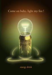 by nanaris 8050 views - final score: 58.5% | Official artist's milk 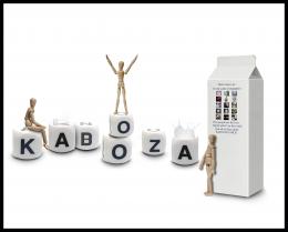 by erathion 12038 views - final score: 57.8% | Kabooza COCO' 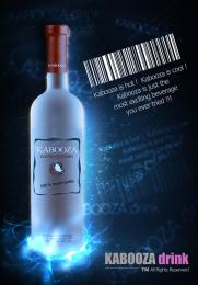 by genuine2009 11867 views - final score: 57.8% |
Kabooza Juice  by nasirkhan 8461 views - final score: 57.8% | Disrespect Your Thirst! 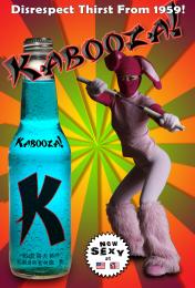 by blindscientist 12120 views - final score: 57.5% | Modern Twist!!  by AngeldustUK 6339 views - final score: 57.4% |
It's Peachy!  by AngeldustUK 4256 views - final score: 56.9% | The new power drink. 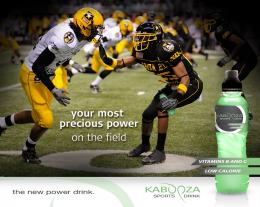 by Ressiv 6008 views - final score: 56.6% | Sophistication 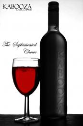 by Geexman 3807 views - final score: 56% |
Beer  by filantrop 4837 views - final score: 54.1% | Wine  by Nator 4251 views - final score: 53.6% | grape lemon watermelon pepper 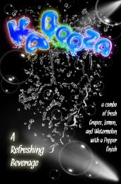 by Drivenslush 7515 views - final score: 52.6% |
That charms 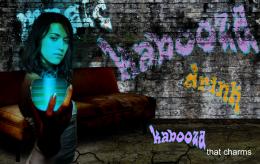 by filantrop 3831 views - final score: 51.6% | Convention Catalog Page 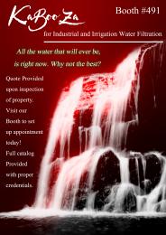 by Drivenslush 7173 views - final score: 49% |
Howdie Guest!
You need to be logged in to rate this entry and participate in the contests!
LOGIN HERE or REGISTER FOR FREE
Photography and photoshop contests
We are a community of people with
a passion for photography, graphics and art in general.
Every day new photoshop
and photography contests are posted to compete in. We also have one weekly drawing contest
and one weekly 3D contest!
Participation is 100% free!
Just
register and get
started!
Good luck!
© 2015 Pxleyes.com. All rights reserved.


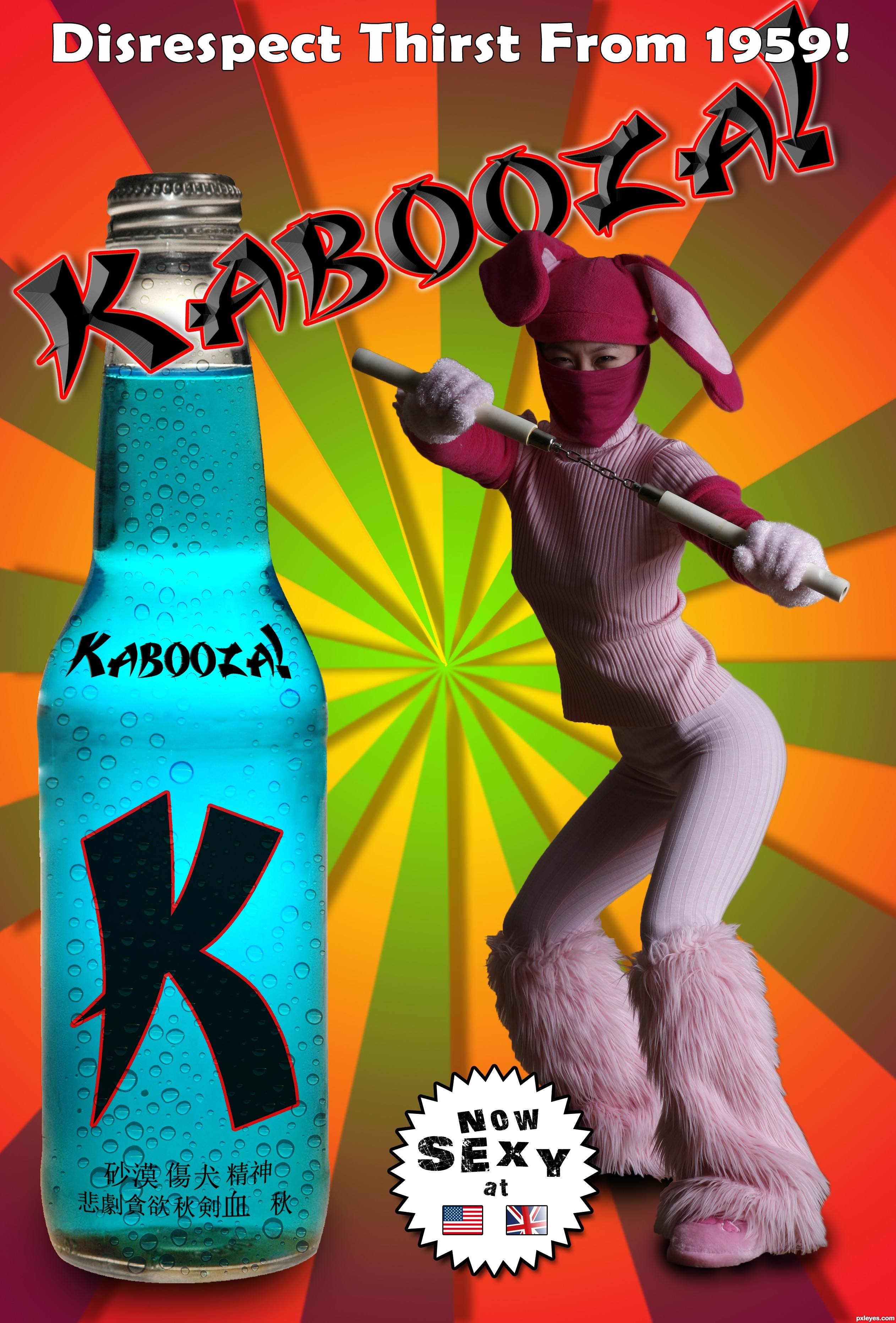
nicely done -- like the font and the overall look
Good one!
Sexy, tough and good mood! The choice of font for the logo fits with the rest, personally I wouldnt use the emboss but a bit thicker outline so it will look more powerful. Also, I wouldnt put the tagline on top over the logo, give it some more space above (or make it smaller) so that the logo is good visible. Good luck!
Edit: another tiny thing about the background: if you flip the gradient from red (outside) to yellow (middle) it´ll have a more depth feeling (red is warmer/ closer to you, yellow is "colder", further away), just an idea...
Sort the union jack out!
I think the overall impact would be better if the main name didn't have the soft bevel.
Some very good suggestions here, so thank you all. Waz (and JamesD), I changed the emboss from a soft to a hard chisel, and I think nit looks a lot better. Also, I left the outer glow white, but gave it a red stroke to match the "K" on the label, and it too seems more powerful and consistent. As for the tagline going over the logo, I chose to leave that there rather than reduce the size of the two main characters in the ad. A lot of Japanese ads seem to do this kind of thing, almost to the point of being confusing, but that was partially the point - to emulate an ad that didn't quite make it across the ocean intact. that said, the suggestion to flip the background gradient was also a good one. I had red in the center similar to the Japanese "rising sun" flag, but it does indeed get more depth with them reversed. Thanks for the tip, the kudos (particularly the nod from CMYK - he must be getting soft in hi old age ), and rest of the suggestions all.
Very creative and convincing! I would observe that while the logo starts in front of the bottle, it then goes behind the ninja bunny ear, so terminating behind the tag line makes sense. I would delete the border around the 11 o'clock sun ray to make it match all the other rays, however.
Goo work. Name of the brand should be more visible, may be you can change the outline colour or the thickness.
colourful!! good
Better!.... but the UNION JACK!
Great Job!!! Really love the overall effect... GOOD LUCK!
Thanks Slushy...
Very very good...i like humor,i like overall mood and of course i like execution...best of luck author
Thanks erathion. No one's commented on humor yet...the whole piece is supposed to be funny!
Of course it's funny!

I can't read many kanji words, but you wrote "desert" on the bottle, didn't you? And something like "exciting", I suppose...
Excellent entry, however you should have taken the warning about the Union Jack, we`ve invaded for far less lol
LOL nice job I like it
Congrats
Howdie stranger!
If you want to rate this picture or participate in this contest, just:
LOGIN HERE or REGISTER FOR FREE