Spec Thanks to MShades for use of two of his pictures
found on Flickr photo sharing.com in the park album (5 years and 3506 days ago)
Its ok, don`t be afraid 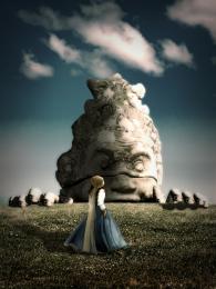 by Geexman 10699 views - final score: 59.3% | Fantasy-Menhirs  by Christy 10139 views - final score: 58.6% | Solus  by erathion 8342 views - final score: 57.8% |
Get Off My Lawn!!! Dagnabbit!  by Drivenslush 11535 views - final score: 55.2% | Ghostland  by CorneliaMladenova 7731 views - final score: 54.6% | Dark Green  by Lamantine 5396 views - final score: 54.6% |
MANO  by lolu 3999 views - final score: 54.1% | :)  by apocalips 2757 views - final score: 53.7% | Mug set  by SMC 7968 views - final score: 53.2% |
A Day On The Hill 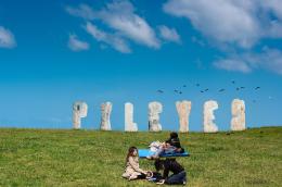 by Chuck 6083 views - final score: 51.8% | Leaning Menhirs  by Christy 6551 views - final score: 49.5% |
Howdie Guest!
You need to be logged in to rate this entry and participate in the contests!
LOGIN HERE or REGISTER FOR FREE
Photography and photoshop contests
We are a community of people with
a passion for photography, graphics and art in general.
Every day new photoshop
and photography contests are posted to compete in. We also have one weekly drawing contest
and one weekly 3D contest!
Participation is 100% free!
Just
register and get
started!
Good luck!
© 2015 Pxleyes.com. All rights reserved.


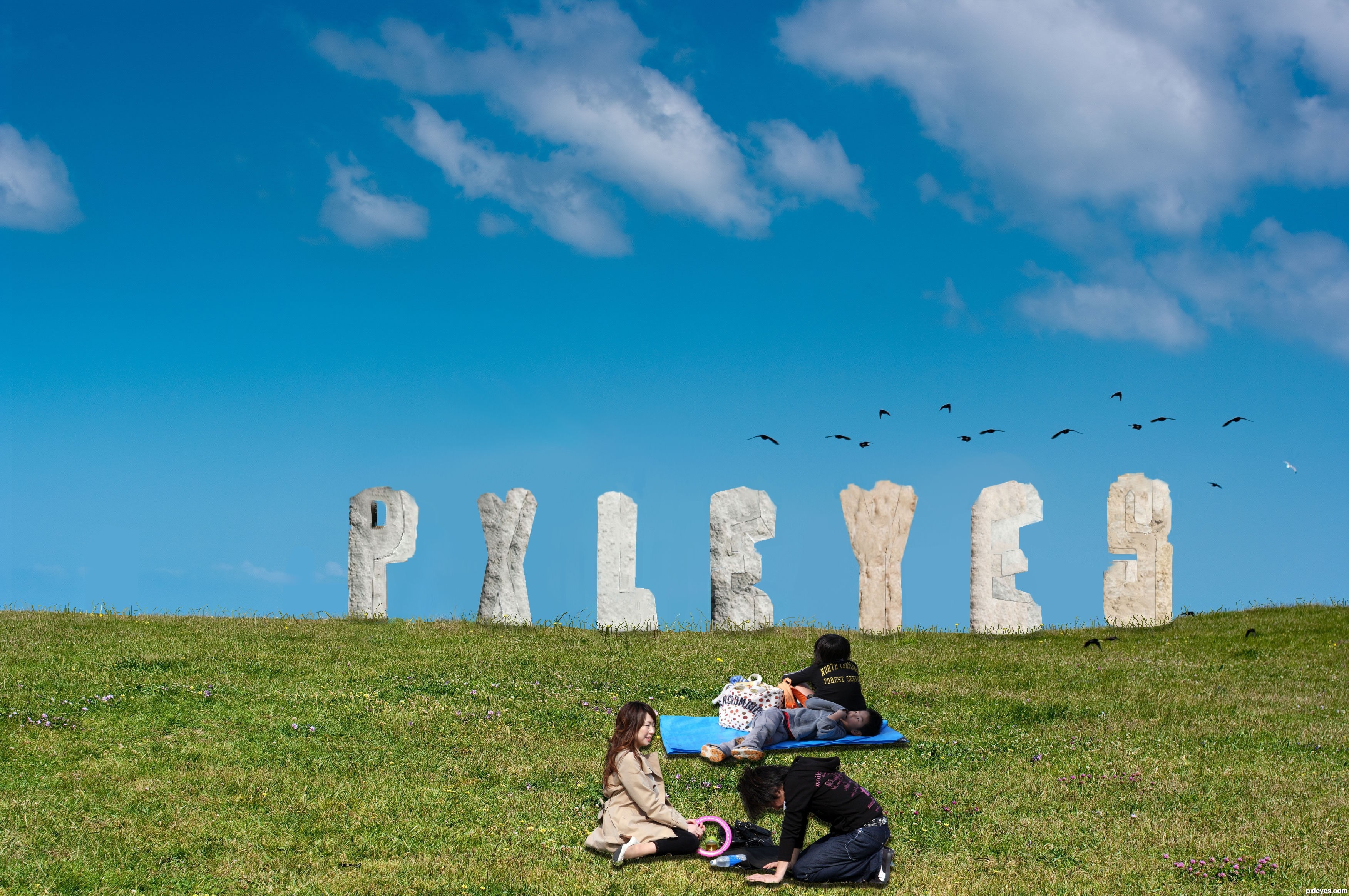
idea is fine -- execution needs some touch up -- all the holes need to have depth as was done in the "P" -- edges should not be straight lines as I doubt that stone would weather to a straight edge
Hey Thanks Alan2641 I did some touch up on what you said any better?
Author the touch-ups are still not quite right IMO, the edges are still too sharp and/or straight. You can try using the eraser with less opacity and fill adjustments. I would use it set at 10% and 10% so you can control it better. Good luck author
good thinking
Creative idea, but the letters need a lot more shadows on their under [ground-facing] sides. I would also consider moving the young adults to the left edge (with probably a horizontal flip and maybe having the kids in front slightly overlapping so the people form a single element) for a more-diagonal composition instead of having all the elements on the right-hand side.
Thanks all I did some readjustments but I maybe should have stayed away from the stone letters
cool idea...gl
Howdie stranger!
If you want to rate this picture or participate in this contest, just:
LOGIN HERE or REGISTER FOR FREE