(5 years and 3499 days ago)
1 Source:
kabooza 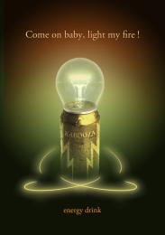 by nanaris 8054 views - final score: 58.5% | Official artist's milk 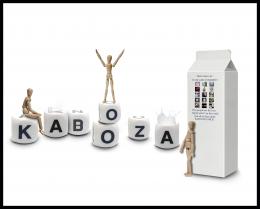 by erathion 12047 views - final score: 57.8% | Kabooza COCO' 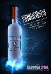 by genuine2009 11875 views - final score: 57.8% |
Kabooza Juice 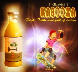 by nasirkhan 8467 views - final score: 57.8% | Disrespect Your Thirst! 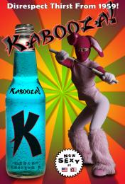 by blindscientist 12132 views - final score: 57.5% | Modern Twist!!  by AngeldustUK 6342 views - final score: 57.4% |
It's Peachy! 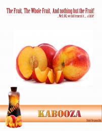 by AngeldustUK 4259 views - final score: 56.9% | The new power drink. 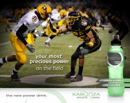 by Ressiv 6011 views - final score: 56.6% | Sophistication 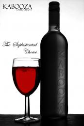 by Geexman 3809 views - final score: 56% |
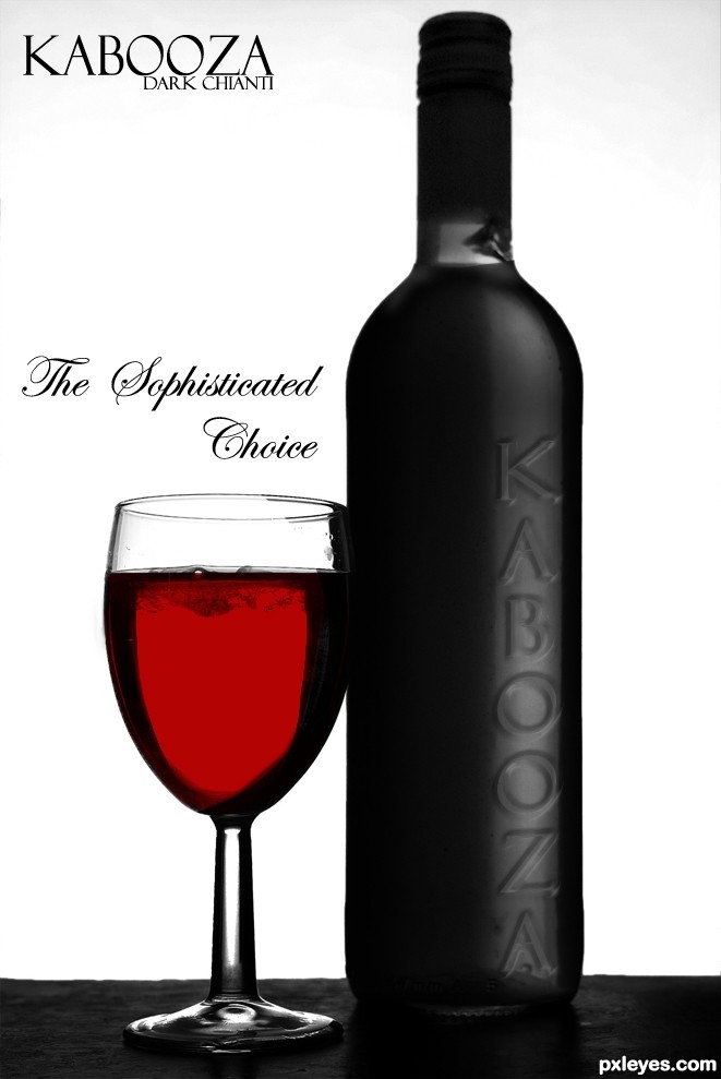
Beer  by filantrop 4838 views - final score: 54.1% | Wine  by Nator 4256 views - final score: 53.6% | grape lemon watermelon pepper  by Drivenslush 7526 views - final score: 52.6% |
That charms 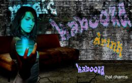 by filantrop 3836 views - final score: 51.6% | Convention Catalog Page 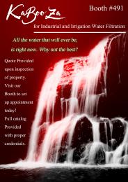 by Drivenslush 7177 views - final score: 49% |
Howdie Guest!
You need to be logged in to rate this entry and participate in the contests!
LOGIN HERE or REGISTER FOR FREE
Photography and photoshop contests
We are a community of people with
a passion for photography, graphics and art in general.
Every day new photoshop
and photography contests are posted to compete in. We also have one weekly drawing contest
and one weekly 3D contest!
Participation is 100% free!
Just
register and get
started!
Good luck!
© 2015 Pxleyes.com. All rights reserved.


Elegant look, but drinking vodka out of a wine glass is dubious sophistication. I think using the same font for the "Kabooza" in the headline as used for the one on the bottle would be stronger branding.
I think the bottle text needs to come more towards the light... and I think the text is the same as the headline... from what I can see... ???
Yes James, Dan is mistaken.. the font is the same & thank you for your comment
I agree with James, the bottle text needs to come into the light more. Maybe put it on the other side.
Good idea, wrong glass! Looks good, though...
I love the high relief effect on the label, it's very elegant. But I suppose you have to change the glass...
The bottle text must be distorted as the O's on the bottle are nearly perfect circles while the O's in the headline are ovals -- so I would stretch out the headline to match the bottle.
nice work
Thanks for all the comments guys, I`ve made some alts that cover all of your suggestions, slightly removed from my original concept but I trust your judgement.......... I think
Nice... much more convincing... GL!
Great work on a bottle author...Whole mood looks very professional and strong...well done
Howdie stranger!
If you want to rate this picture or participate in this contest, just:
LOGIN HERE or REGISTER FOR FREE