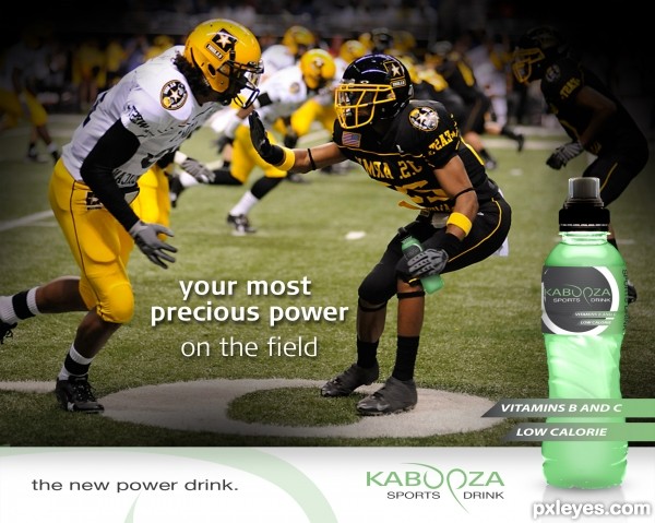
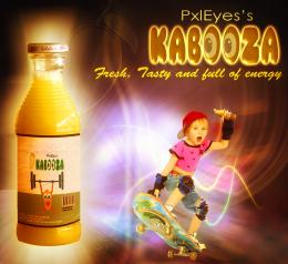
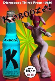
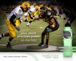
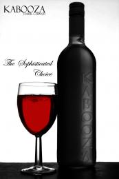
Logo and label made with Illustrator. The rest is Photoshop.
This is meant to be one advertisement in a sery of ads. All with the same subject "your most precious power", than followed by different ideas with different photos. (5 years and 3497 days ago)
2 Sources:



Looks professional. Nice job!
Convincing, except for the writing on the uniforms which is backward as a result of flipping that source. The O's in the logo are cool.
^ doesn`t his talent for spotting the finest details just make you wanna poke him in his eagle eyes....lol Good work author, a very proffessional looking ad ( I`ll let you off for it only being aimed at americans )
)
nice work author
Howdie stranger!
If you want to rate this picture or participate in this contest, just:
LOGIN HERE or REGISTER FOR FREE