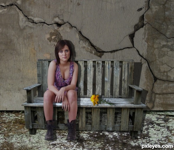
Thanks to: njelliott for the pic of the girl.
Thanks to: Emik for the pic of the cracked wall.
Thanks to: pingenvy for the pic of the texture (ground).
Thanks to: Van049 for the pic of the coreopsis.
The rest is PS.
UPDATE: Lowered brigthness on the girl, moved the bench higher, changed ground, and corrected shadow. (5 years and 3500 days ago)



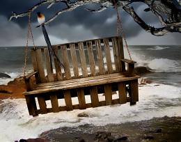



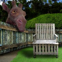
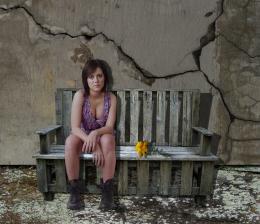
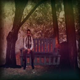


Nice work. Just a couple things, the bottom of the bench would be even with the bottom of your cracked wall, which is throwing off your perspective. Aside from that the girl is just a little too bright for the other images used. Good Luck!
The image is UPDATED: Thank you for your comment and suggestions....
Maybe you could look at the paving also, the perspective is wrong as they look like they are similar to the wall instead of being at right angles to it.
Different style of work, author! Very nice...

I agree with solkee; the perspective of the ground is the point.
good idea, but the bench is in the air. Instead of drop shadow give perspective shadow. And also the floor tiles perspective need to be corrected.
Thanks for comments, changed the ground and corrected shadow.
Nice work, and thanks for using one of my pictures, looks great here = )
Howdie stranger!
If you want to rate this picture or participate in this contest, just:
LOGIN HERE or REGISTER FOR FREE