i will update sbs soon
(5 years and 3555 days ago)
4 Sources:
- 1: JoLin
- 2: itsallgood
- 3: Eric MATVEEFF
- 4: c
i will update sbs soon
(5 years and 3555 days ago)
Mask 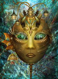 by CorneliaMladenova 10257 views - final score: 65.4% | Blown away  by r1k3r 56031 views - final score: 63.8% | The Burden  by arca 19184 views - final score: 63.1% |
Encounter 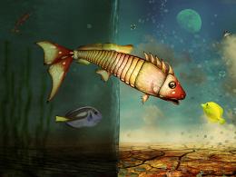 by CorneliaMladenova 7752 views - final score: 61.6% | Vulcan Blackbird 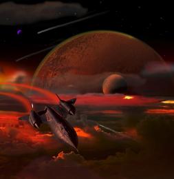 by lchappell 9805 views - final score: 61.5% | Adorned with Ribbons 'n Lace 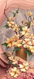 by artgirl1935 8256 views - final score: 60.4% |
Swinging Pasta... 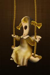 by loopyluv 5845 views - final score: 60.3% | Bizarre Star 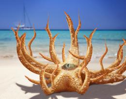 by intrinsic 6862 views - final score: 57.2% | Dragon without teeth  by niks1351 8641 views - final score: 56.2% |
nameless  by apocalips 6795 views - final score: 56% | Turtle Seal  by intrinsic 12100 views - final score: 55.5% | Odd Still Life 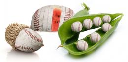 by Alan2641 4009 views - final score: 54.2% |
queen of the night  by andi 6476 views - final score: 54.1% | Heroes' Choice 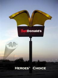 by velkanx 8013 views - final score: 53.7% | Zombie  by Gransbergis 6146 views - final score: 53.6% |
little moises  by nanaris 5383 views - final score: 53.1% | jack is DEAD....!  by dekwid 3859 views - final score: 52.9% | Unborn eggs  by Gransbergis 5452 views - final score: 52.8% |
Better tell Darth...  by Seymour 12963 views - final score: 52.8% | Strange dream 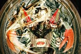 by bingbong088 7062 views - final score: 51.9% | nameless  by apocalips 3384 views - final score: 51.1% |
Flower Vase 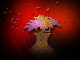 by weso 5376 views - final score: 48.7% |
Howdie Guest!
You need to be logged in to rate this entry and participate in the contests!
LOGIN HERE or REGISTER FOR FREE
Photography and photoshop contests
We are a community of people with
a passion for photography, graphics and art in general.
Every day new photoshop
and photography contests are posted to compete in. We also have one weekly drawing contest
and one weekly 3D contest!
Participation is 100% free!
Just
register and get
started!
Good luck!
© 2015 Pxleyes.com. All rights reserved.


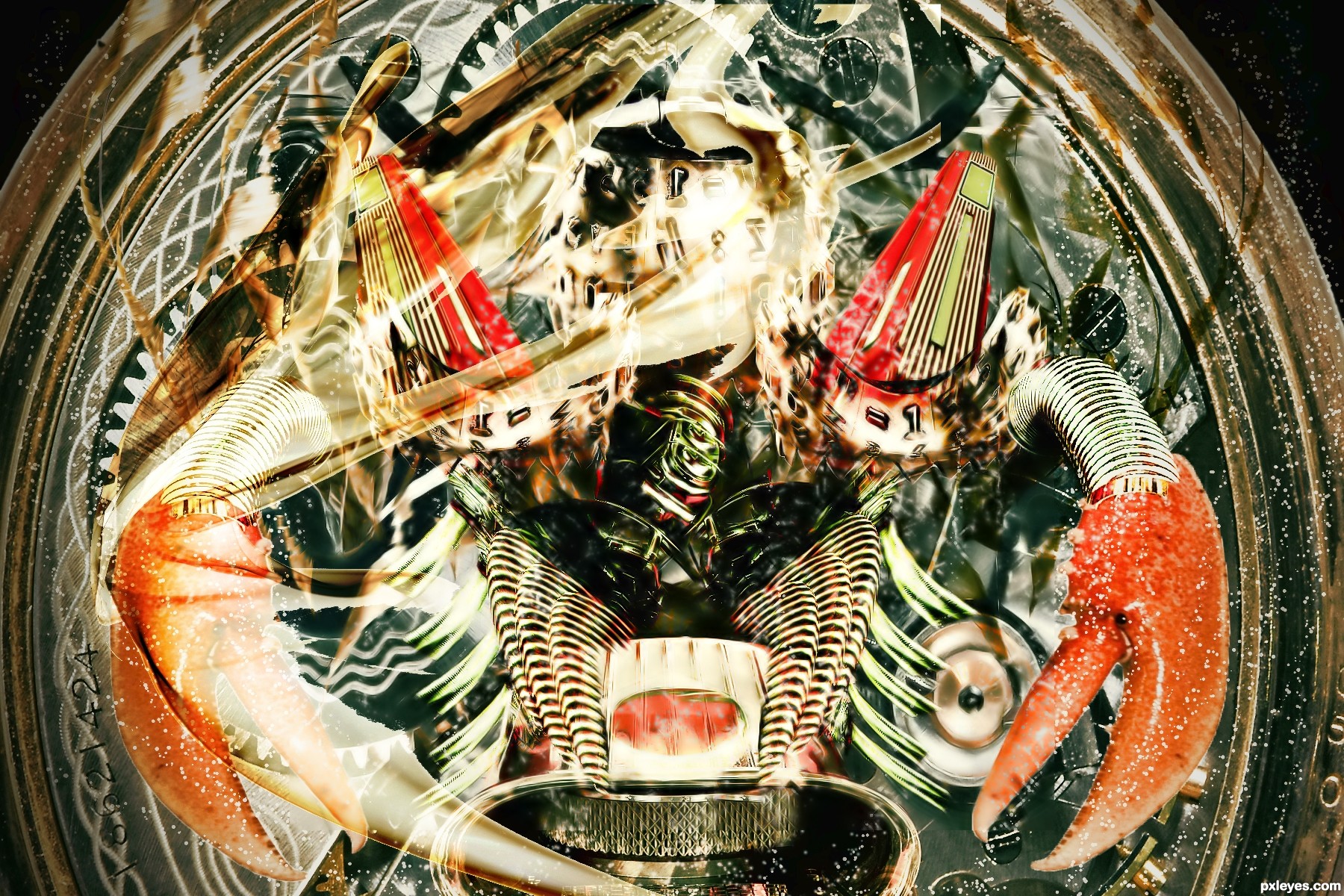
The red triangular sections are too translucent, fading away from the rest of the image.
The curved and warped parts of the type ball on the left shows too obviously that you flipped the image - the type is backwards.
The composition is too "mirror perfect" in some areas, and too "non-mirrored" in others, most noiticeably in the lines above the crab claws. The one on the right isn't connected at the end, and is straighter than the one on the right. This inconsistency gives a poor technical visual effect, rather than being a creative part of the design.
plz view in high resolution
cool construction...gl
Howdie stranger!
If you want to rate this picture or participate in this contest, just:
LOGIN HERE or REGISTER FOR FREE