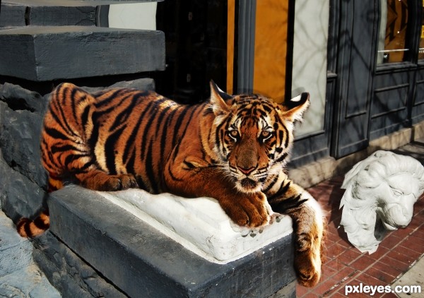
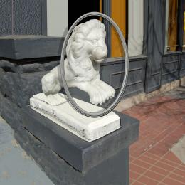
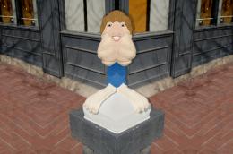
Removed the statue, fixed the background (added some height to make better perspective so that the tiger and statue appear larger). Added a tale for the tiger from another source (hard work with the colours). The rest is handwork and HDR toning/color adjustment. (5 years and 3461 days ago)

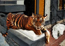
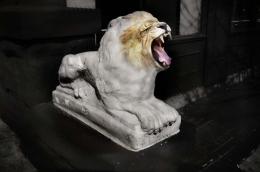


Nice job, my only criticism is that the lion head looks like its balancing on its point on the ground and isn't too realistic. If you lay it flat on the ground and adjust the shadow accordingly it will look better. A few other fragments of broken plaster would also look good but that's a fair bit of work :P
too much distortion on rear part of tiger.....otherwise brilliant idea.
GO TIGER GO!!!!
Howdie stranger!
If you want to rate this picture or participate in this contest, just:
LOGIN HERE or REGISTER FOR FREE