(5 years and 3481 days ago)
1 Source:
cop  by Chalty669 12009 views - final score: 63.6% | Old Man  by WYSIWYG 53418 views - final score: 62.3% | al muro  by nanaris 15238 views - final score: 61.7% |
Harlequin 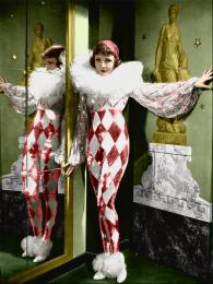 by jadedink 35710 views - final score: 61.2% | Play time... 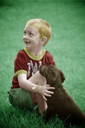 by hereisanoop 11792 views - final score: 61% | Blonde  by DigitalPro 7586 views - final score: 59.3% |
Soldier 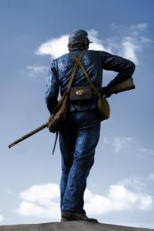 by Alan2641 6360 views - final score: 59.1% | morning  by steed 7227 views - final score: 58% | SAD DOG  by jestrada2010 8645 views - final score: 57.8% |
suicidal glam 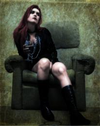 by dekwid 4561 views - final score: 57.4% | Suffragettes with flag 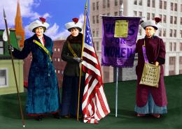 by lchappell 8727 views - final score: 57.1% | Yellow Rose  by Norman 7404 views - final score: 56.9% |
Grandmother 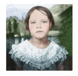 by tinasedits 8261 views - final score: 56.5% | Old family photo 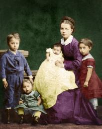 by friiskiwi 6786 views - final score: 56.5% | FATIMA 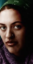 by lolu 4558 views - final score: 56.3% |
Granny n Grandpa 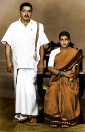 by sprasanna89 9489 views - final score: 56.1% | Angel 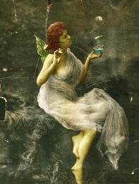 by Lamantine 5656 views - final score: 55.9% | Misses jones 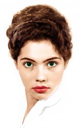 by lolu 9411 views - final score: 55.3% |
Memories 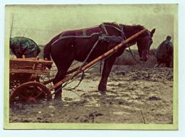 by lobusdexter 4434 views - final score: 54.6% | Ghost Dancer 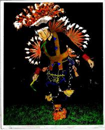 by cabldawg71 5597 views - final score: 54.5% | church on SUNday 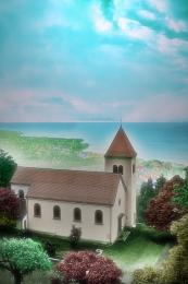 by dekwid 4643 views - final score: 54.3% |
Lady in Red 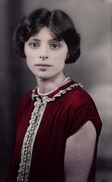 by olseado 9030 views - final score: 53.8% | Rastafari train 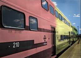 by donarkz 9659 views - final score: 53.4% | The Middle Class Dream  by Widiar 6484 views - final score: 52.1% |
nameless 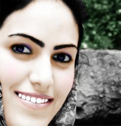 by apocalips 3074 views - final score: 51.6% | Dawn  by downoffthedragon 6674 views - final score: 51.5% |
Howdie Guest!
You need to be logged in to rate this entry and participate in the contests!
LOGIN HERE or REGISTER FOR FREE
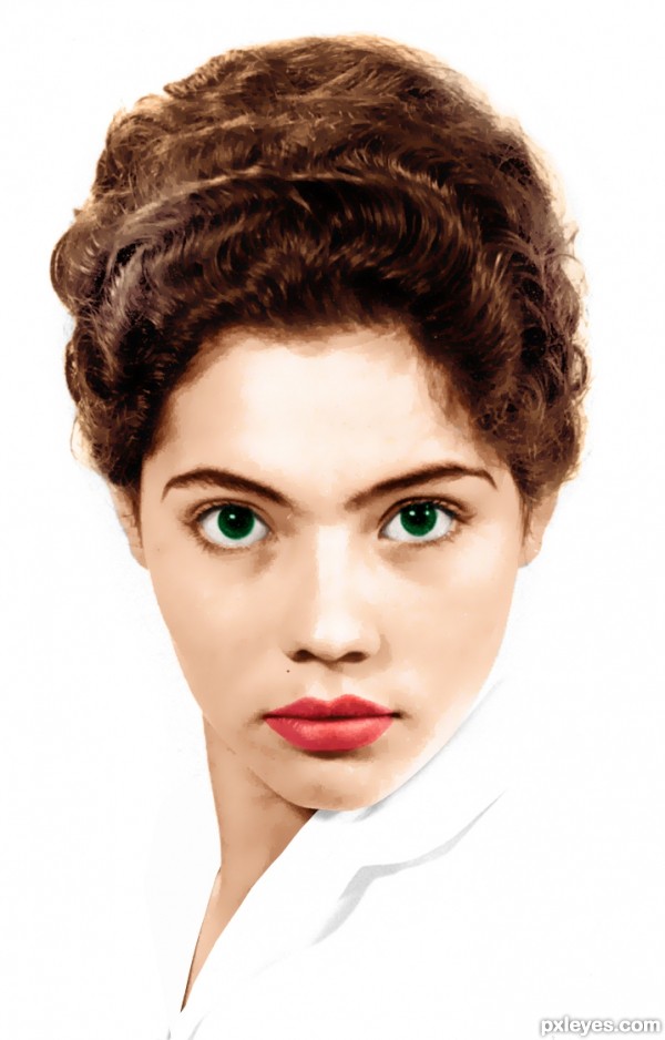
author.. when you added the texture to the clothing.. you need to distort/warp the pattern so it follows the folds of the original fabric.. try displacement map tutorials (there are several) (you could also just nudge the texture around with warp tool/liquify.. that might help.. just gentle)

also the title of the piece.. I think it is suppose to be Misses Jones...
Good luck.. the work on the face is fantastic
EDIT: Much improved
LOL she looks scary.....
 ......though nice results....
Thanks to all for your comments and advices, Drivenslush i go change the title !
I follow your advices CMYK46 and Drivenlush i put away the texture because i need to train a little bit with a good tutorial
Well done, it looks lovely without that texture..Good luck
Looks much better without that texture. One thing you could do, either lower the amount of green in her eyes, or if you really like the bright green you can darken the pupils so they show more. Here eyes just look a bit strange to me, since they look all green and don't seem to have pupils.
Howdie stranger!
If you want to rate this picture or participate in this contest, just:
LOGIN HERE or REGISTER FOR FREE