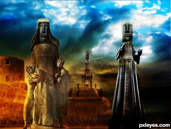
(5 years and 3477 days ago)
4 Sources:
Vanity 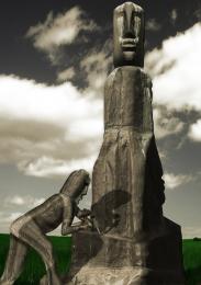 by Geexman 9198 views - final score: 59.7% | Love is in the air... 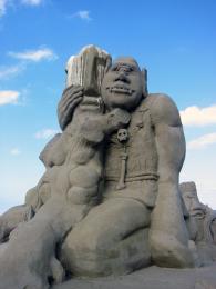 by apicula 17214 views - final score: 59.5% | Stone Man 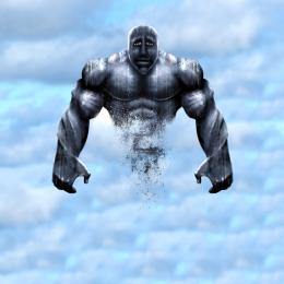 by tnaylor21286 11746 views - final score: 59.3% |
SACRIFICE 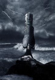 by Siddhartha 8926 views - final score: 58.7% | Not This Time... 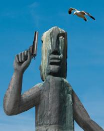 by spaceranger 9356 views - final score: 57.5% | The Sacred Family 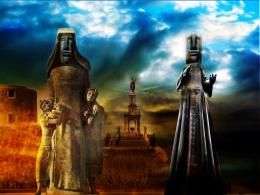 by Widiar 7366 views - final score: 56.7% |
Peace Time 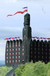 by pingenvy 5058 views - final score: 55.1% | Sign Of Wish 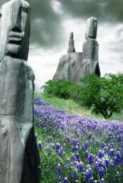 by hidra 7138 views - final score: 55.1% | Throwing the Ocean 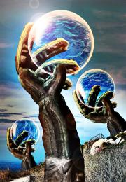 by Drivenslush 6713 views - final score: 54.1% |
Lots of heads 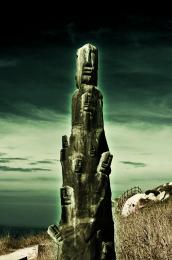 by Gransbergis 4955 views - final score: 52.5% | Waves Of Purity 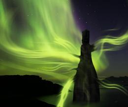 by Lamantine 5826 views - final score: 52% | Adam and Eve  by bingbong088 8549 views - final score: 50.5% |
Howdie Guest!
You need to be logged in to rate this entry and participate in the contests!
LOGIN HERE or REGISTER FOR FREE
Good idea, nice clean chop! If you can flip the background statue it'll match the light source on the left foreground statue.
Always a keen eye, good observation. I was so fixated with the building and colours I forgot to think about the statue itself. Inverted it to match the left oriented light source, thanks CMYK.
wow, I like this colorful implementation. The warm colors of the left side. Also a good idea to segue dark to the right.
I think it could be a good idea to associate the right staue more with the background, it seems now a lil bit superimposed.
nice colors author and cool mood...
Howdie stranger!
If you want to rate this picture or participate in this contest, just:
LOGIN HERE or REGISTER FOR FREE