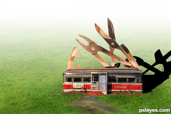
(5 years and 3470 days ago)
3 Sources:
- 1: By Muffet
- 2: by vzaliva
- 3: by sachab
Bad Girls Crest 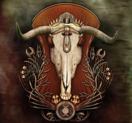 by CorneliaMladenova 13722 views - final score: 62.6% | Swiss Army Bot 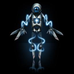 by tnaylor21286 8440 views - final score: 58.9% | Bird  by lahiripartha 6613 views - final score: 57.9% |
Hybrid 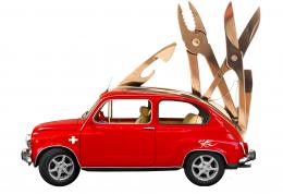 by lespaul11 12914 views - final score: 55.4% | Freedom  by shankarsadamate229 7307 views - final score: 54.6% | Flower  by lahiripartha 4562 views - final score: 54.4% |
Edward Swiss Army Hand  by Drivenslush 7830 views - final score: 53.9% | Diner 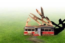 by donarkz 5879 views - final score: 53.2% | RP Knife 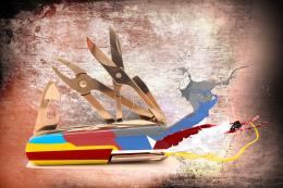 by donarkz 9178 views - final score: 53% |
Howdie Guest!
You need to be logged in to rate this entry and participate in the contests!
LOGIN HERE or REGISTER FOR FREE
...so in this diner we don´t use forks?
The shadow is way to sharp though, might wanna lean it a little bit more also.
Otherwise - cool work! GL
Agree with sunzet.. but i'd rather say the shadow is WAY too sharp ..
GL tough it's a nice entrie !!
Very cute idea!! In high res my only gripe would be the pathway leading up to the diner is in focus but the grass on either side is very blurry...Best of luck
Nice idea. I would suggest some gaussian on the shadow with greatly reduced opacity. The ambient light would make the shadowed grass visible. Also, since the grass is blurry, a little blur may help the diner fit in better too.
Wonderful concept.
shadow is standing....correct it
the perspective of the shadow is wrong and it is very sharp...u shud have blurred it...
very cool idea and nice work...gl
Howdie stranger!
If you want to rate this picture or participate in this contest, just:
LOGIN HERE or REGISTER FOR FREE