
I started out with one idea and it developed - most of the working has been in Warp. (5 years and 3465 days ago)
Have a Nice Day :-)  by tnaylor21286 19597 views - final score: 59.3% | Burn Out  by Nator 17243 views - final score: 58.5% | Eat My Source!  by Geexman 14384 views - final score: 58.5% |
Key of SUCCESS  by shankarsadamate229 15462 views - final score: 58% | Guess what part?  by sunzet 20207 views - final score: 57.6% | Computer Graphics Community  by hidra 12367 views - final score: 57.1% |
clocks  by apocalips 10528 views - final score: 57.1% | Design  by donarkz 10535 views - final score: 56.8% | Irony  by CMYK46 6643 views - final score: 56.8% |
Welcome 2011  by ashwinisadamate 10902 views - final score: 56.6% | E.O. Wilson Quote  by Drivenslush 8463 views - final score: 56.3% | LIA  by dekwid 3669 views - final score: 56.3% |
Ironic  by sunzet 7877 views - final score: 56.2% | Guitar  by lespaul11 11780 views - final score: 56.1% | The time is now  by Concrete 6973 views - final score: 55.9% |
Typo Design  by genuine2009 9305 views - final score: 55.4% | I love You  by apicula 11854 views - final score: 55.3% | Just say yes  by KingRafox 11977 views - final score: 54.7% |
Never just Black&White  by Nays 12121 views - final score: 54.5% | Just another BRICK in the wall  by ramsesje 11299 views - final score: 54.4% | Three Words  by ponti55 5768 views - final score: 54.4% |
For all of us!  by shankarsadamate229 6233 views - final score: 54.1% | ||Om Namaha: Shivaya||  by shankarsadamate229 22402 views - final score: 53.6% | The Digital Age  by Booshie5ives 11205 views - final score: 52.6% |
Speed Hump  by Oriel 7459 views - final score: 52.2% | Complete darkness  by sunzet 7698 views - final score: 51.1% | Sister's simple philosophy 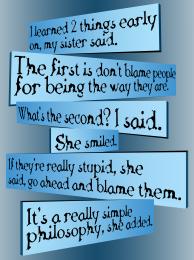 by CMYK46 6764 views - final score: 50.7% |
Ill never find another you.  by Oriel 7987 views - final score: 50.6% | lava  by sanjugs 7036 views - final score: 49.8% | The Great Dictator.  by PhillEvans 92892 views - final score: 47.5% |
Howdie Guest!
You need to be logged in to rate this entry and participate in the contests!
LOGIN HERE or REGISTER FOR FREE
Mostly blurry...
Cute idea, but the 'p' is lost, looking more like a ball. Perhaps a white line (solid or dashed) in the center of the letters would help define the 'p' better, and give it more "road" cred.
Hi MossyB - I had wondered about that myself but the dotted line has me beat . I have worked on a modification and will upload it as part of the sbs for comments sake. I just dont specially like it. You know Im extremely short sighted -f i didnt wear my glasses mostly blurry would be the theme of my life
  speed bumps in real life would be a total surprise.
Yes CMYK46 mostly blurry as you say
Howdie stranger!
If you want to rate this picture or participate in this contest, just:
LOGIN HERE or REGISTER FOR FREE