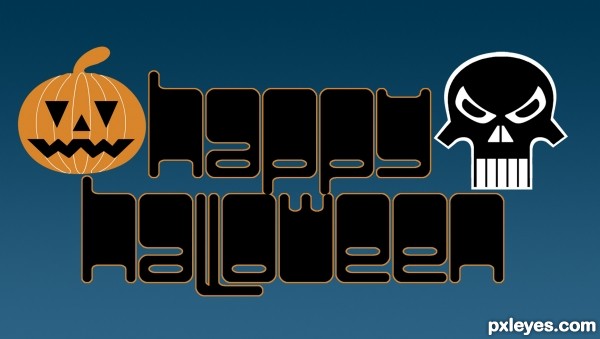
This was supposed to go into the Typography contest, but there was no room. Everything in the image was created from the fonts shown in the SBS. (5 years and 3461 days ago)
The dance of eternity  by langstrum 14141 views - final score: 66.5% | Someone spiked my drink!  by loopyluv 15379 views - final score: 64.3% | No Safe Haven  by arca 15293 views - final score: 63% |
Geisha 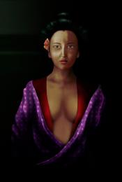 by bompy 12884 views - final score: 61.9% | Violon 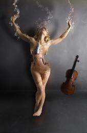 by athenya 12074 views - final score: 59.9% | Meat Market 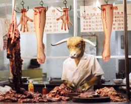 by RickLaMesa 13424 views - final score: 59.5% |
BLUE EYE 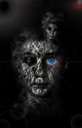 by lolu 6973 views - final score: 59.5% | Wingman 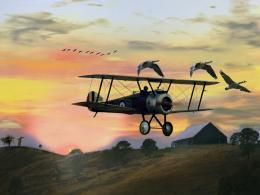 by lchappell 5955 views - final score: 59.3% | And it Lingers 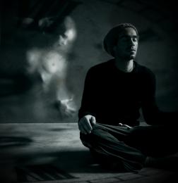 by jadedink 5292 views - final score: 59.1% |
dirtdonedirtyD 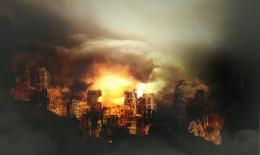 by dekwid 4050 views - final score: 59% | Chernobyl Farms 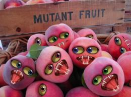 by spaceranger 6281 views - final score: 58.7% | Dino Steel/Dino Chrome 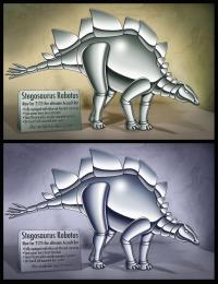 by spaceranger 9607 views - final score: 57.9% |
SPECIES 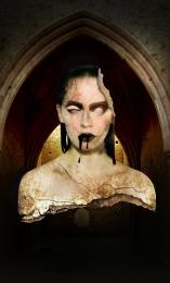 by velkanx 6963 views - final score: 56.3% | Splashy Artwork 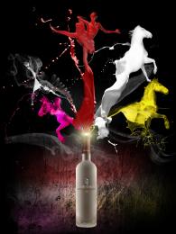 by donarkz 11056 views - final score: 56.3% | the angel 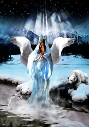 by jack2 7065 views - final score: 55.2% |
Ying yang 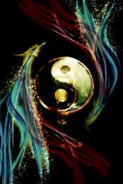 by bingbong088 15387 views - final score: 54.8% | night witch 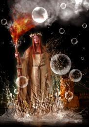 by jack2 6529 views - final score: 54.7% | painter forest 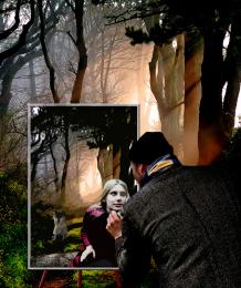 by apocalips 3518 views - final score: 53.2% |
The castle at night 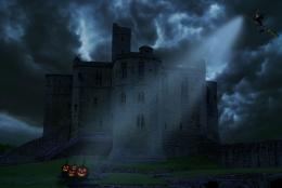 by nishagandhi 13560 views - final score: 52.7% | Over rafting 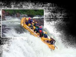 by donarkz 9086 views - final score: 51.7% | Happy Halloween! 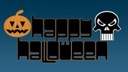 by CMYK46 4795 views - final score: 51.1% |
The Council Deliberates 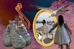 by downoffthedragon 6754 views - final score: 50.3% | caged 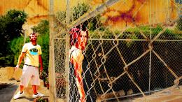 by anarchick 3588 views - final score: 46.3% |
Howdie Guest!
You need to be logged in to rate this entry and participate in the contests!
LOGIN HERE or REGISTER FOR FREE
Great creativity on creating the pumpkin and skull!
fab fab fab fabulous !!!!
I like it, very nice.
Fun. However, the white on the skull makes it really pop out and overpower the text which I think should really be the focus. I would replace the white with the pumpkin's color and maybe replace the stroke around the text with a brighter (and possibly thicker) color.
Howdie stranger!
If you want to rate this picture or participate in this contest, just:
LOGIN HERE or REGISTER FOR FREE