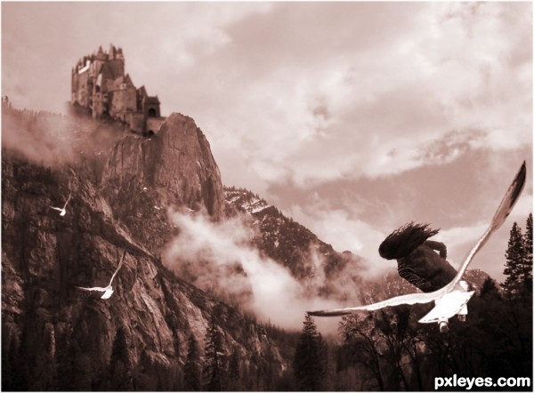
(5 years and 3441 days ago)
3 Sources:
The Battle  by Zakfuego 14280 views - final score: 62.8% | Rooted: I want To Fly-Updated  by apixeldot 18432 views - final score: 62.4% | Happiness is..  by ponti55 15787 views - final score: 59.7% |
Kingdom of Heaven 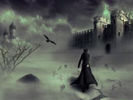 by Siddhartha 15310 views - final score: 58.9% | Between heaven and hell. 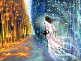 by marina08 30851 views - final score: 58.1% | Bus 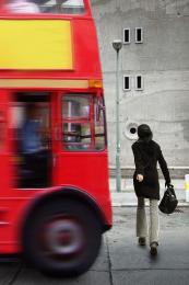 by Nator 4897 views - final score: 56.1% |
stare 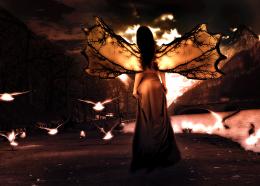 by rakib888 4929 views - final score: 56% | Dawn of the Dragon 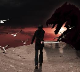 by PSA2009 7177 views - final score: 54.6% | I'm Late  by sanjugs 4827 views - final score: 54.5% |
MARELLA  by DigitalPro 5987 views - final score: 54.2% | Lost Cowboy  by DigitalPro 7492 views - final score: 53.7% | yearing 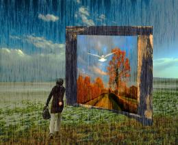 by hazem 5535 views - final score: 53.5% |
Ghost Park Walk 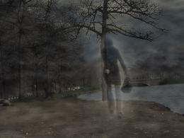 by luvbug1982 11264 views - final score: 52.9% | Trip 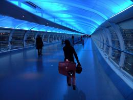 by gplazi 4096 views - final score: 52.7% | Seeking Help 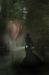 by Lamantine 4897 views - final score: 52.1% |
Through the Portal 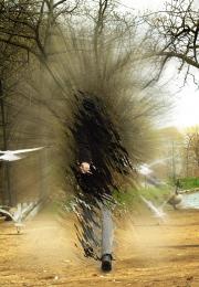 by PSA2009 9403 views - final score: 51.8% | Walking Through A Dream 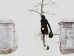 by junkieball 5897 views - final score: 51.3% | Frequent Flyer 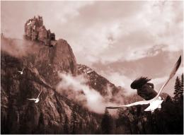 by DigitalPro 5252 views - final score: 51% |
The challenge 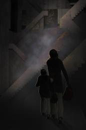 by shankarsadamate229 3680 views - final score: 50.1% | i'ts not about the color  by gornats 5999 views - final score: 49.5% | walk in tempest  by Bikudo38 7632 views - final score: 45.3% |
Howdie Guest!
You need to be logged in to rate this entry and participate in the contests!
LOGIN HERE or REGISTER FOR FREE
Idea is good, but the girl definitely needs legs (unless she's half human, half bird). If you flip the castle it will receive the same light as the mountains & I think you'll be better able to fix the main entrance (which is now fading away and has a bit weird perspective).
Now that I'm checking the composition (which is not bad), you may want to flip the mountain image, put the castle left on top (so it'll become higher) so you get a nice diagonal composition between the foreground (girl, right under) and the background (castle, right above). Just an idea. Good luck!
wazowaski, thank you for your constructive comment - I made the changes and it does look better thanks
I think the birds could be better not so symmetrically positioned in the air, for a more natural feel, IMHO.
Howdie stranger!
If you want to rate this picture or participate in this contest, just:
LOGIN HERE or REGISTER FOR FREE