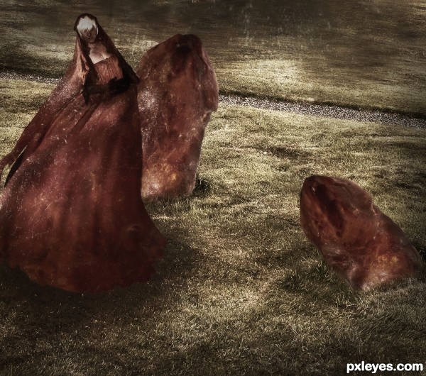
Credits to :
Background - dimitri c
Model - ~firebabystock
Dress - =Ecathe
Work Updated. (5 years and 3466 days ago)
- 1: Background
- 2: Model
- 3: Dress

Credits to :
Background - dimitri c
Model - ~firebabystock
Dress - =Ecathe
Work Updated. (5 years and 3466 days ago)
A gift from the space?  by mqtrf 10912 views - final score: 63% | Kitsune  by jaskier 7614 views - final score: 61.6% | AMBROSIA  by lolu 10375 views - final score: 60% |
Amber 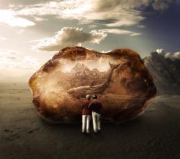 by ponti55 6956 views - final score: 58.6% | Heart of Glass 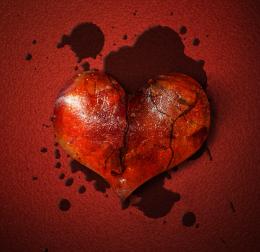 by RickLaMesa 10512 views - final score: 57.5% | yum frog 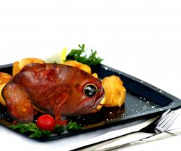 by mircea 7076 views - final score: 55.7% |
Giant Fly in Amber 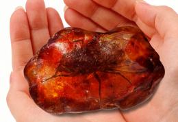 by Alan2641 11808 views - final score: 55.3% | perfect cut  by gornats 6116 views - final score: 55.2% | beef  by madelinerayne 5756 views - final score: 53.8% |
Amber's Waterfalls  by Drivenslush 6492 views - final score: 53.4% | Amber Reborn  by Poss 6327 views - final score: 53.4% | Amber Horse  by shaiju1974 6610 views - final score: 53.2% |
Hula Hoola with Blue Hands  by Drivenslush 7436 views - final score: 52% | Stone age  by shankarsadamate229 7641 views - final score: 51.6% | amber world  by sanjugs 4946 views - final score: 51.5% |
Geology  by Lamantine 3781 views - final score: 51.1% | Clash of the Gargoyles  by mishti 4358 views - final score: 50% | Older than me  by Oriel 4100 views - final score: 49.8% |
Life  by bingbong088 3723 views - final score: 49.1% | necklace 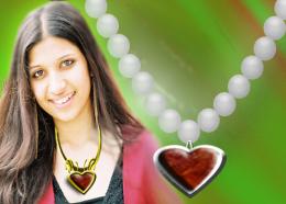 by rupa 7515 views - final score: 47.6% |
Howdie Guest!
You need to be logged in to rate this entry and participate in the contests!
LOGIN HERE or REGISTER FOR FREE
Interesting image.. nice atmosphere. Good luck
Thanks Matteo, I just learned about gradient maps in your tutorial. Thanks so much for those techniques !
nice mood
I really like this image!
I have looked at it on 3 different monitors though and I find it a little dark (for viewing purposes) it is hard to make out the face on the woman (on at 2 of the monitors at least). I thought you may get a better reacton/rating if you can lighten the image (just a tiny bit); not too much as the mood is wonderful.
Maybe a levels adjustment layer set on a screen blend mode and then take it the opacity down to an opacity to just enough for some highlights. You can also mask out parts of the screen layer to apply the lightening to specific areas.
All that said, it has a lovely flow to it and, as I said, a very interesting mood!
Thanks a lot Arc, i'll work on that
Author u could change the colors of the stones to achieve better contrast with the woman...this color is great for the dress and i would not change that but the color of the stones for sure...And u could create some glowing effect on the stones,to cast some lighting on the woman for better effect...This is great creation and would be the same to don't get good score because its to dark and without contrast...good luck
Thanks ! Work Updated.
Great work ... I do like it now ... I can see the image. Hope it works for you
Howdie stranger!
If you want to rate this picture or participate in this contest, just:
LOGIN HERE or REGISTER FOR FREE