(5 years and 3426 days ago)
Modernity  by Akassa 9743 views - final score: 59.7% | Wookey Hollow  by Missy 10043 views - final score: 59% | autumn  by nanaris 11601 views - final score: 58.3% |
pride  by dekwid 9410 views - final score: 56.2% | Jungle Rot 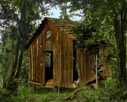 by MossyB 15392 views - final score: 55.9% | old painting 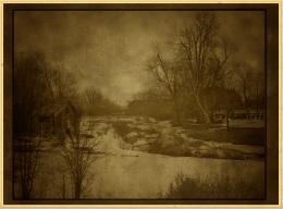 by kathyw 9870 views - final score: 55.3% |
We gotta move! 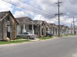 by layerstack 6841 views - final score: 54.3% | Beach Hut 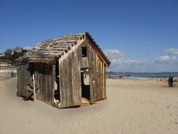 by layerstack 15745 views - final score: 54% | Old House Over the Hill 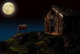 by George55 12342 views - final score: 54% |
nuke proofing 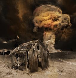 by mircea 9945 views - final score: 53.8% | Rickety path 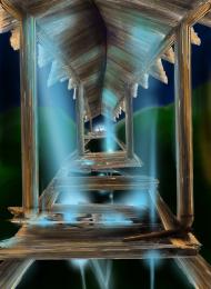 by marina08 5681 views - final score: 53.2% | Who's gonna drive you home ? 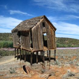 by greymval 12961 views - final score: 53% |
Haunted Cow 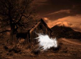 by MoNophian 10871 views - final score: 53% | The execution. 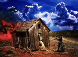 by Nickk 8381 views - final score: 52.9% | Forgotten 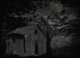 by birdhm 9722 views - final score: 51.8% |
"Good morning " 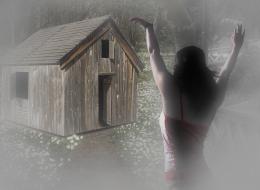 by shankarsadamate229 5911 views - final score: 51.8% | By The Old Shed 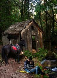 by George55 4937 views - final score: 51.6% | Sweet Retreat 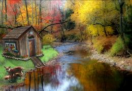 by DigitalPro 5957 views - final score: 51% |
Old Waterfall Wheel House 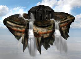 by xwd 12053 views - final score: 50.4% | just reconstruct 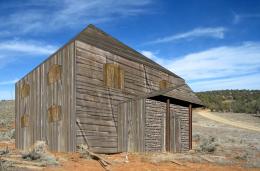 by ONabil 6034 views - final score: 50.2% | loneliness(oil painting) 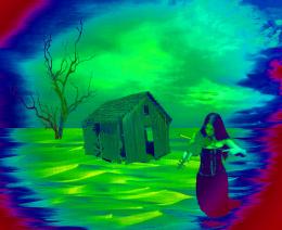 by hazem 8313 views - final score: 47% |
The Ark 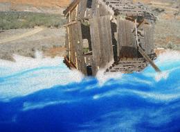 by Vautje 8227 views - final score: 46.8% | Lonely Blue Shack 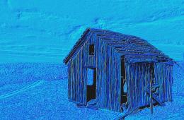 by MossyB 11161 views - final score: 45.6% |
Howdie Guest!
You need to be logged in to rate this entry and participate in the contests!
LOGIN HERE or REGISTER FOR FREE
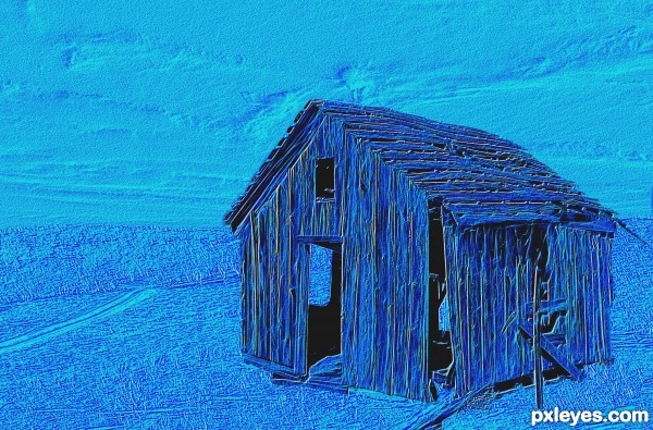
Don't take this wrong, but it's kind of like a "plain filter entry". Since there's no (more) rule about posting filter entries, i guess you can do that, but make it more interesting.
You could: use different tonalities of blue, like a mosaique; make a blue dust cloud that swallows the image, make a floating in the sky shack, etc. Make it cooler.
LOL! "Plain filter entry." Funny after all these years filters still are so denigrated.
Yes, I could have made this a CBR and then applied filters, but I was inspired by a two-page Adidas Ad in Sports Illustrated, that simply embossed a building, made it gold, and put a frame around it, with a photo of Derrick Rose in a gold suit with two fistfuls of money on top...So I played with the emboss filter and a few effects. The Fractalius effect provided a nice pseudo-linework effect, with a bit of color for accent.
Sometimes, "less is more." After 15 years with Photoshop, having been to the extremes of "filters are EVIL," and seeing the "chopped beyond recognition," "warped out of shape," "desaturate it and make it too dark to see," and "add exploding bits and light swirls," forms of "trendy" chopping, I'm now starting to see filters making a quiet comeback. They might not be as "interesting," but that doesn't mean they're not cool. Especially when you don't just click the button, but add gradient masks, adjust contrasts, and work with multiple layers. When Adidas takes out two pages for a colored emboss with a frame on it, I figure subtle is okay, sometimes...
No offense taken, greymval. Thank you for taking the time to comment!
honestly its nice but for the contest i dont think that this is the right entry.. no offense i know you know what it takes to win a competition.
It might be "just filters", but it's an interesting use of them. I like the monochrome with blacks.
ART comes in different kinds of shapes, colors and forms. I think, "even" if you used a filter or a "bevel and emboss" for your work. I love the blue colors and the outcome of your work. Good luck.
Howdie stranger!
If you want to rate this picture or participate in this contest, just:
LOGIN HERE or REGISTER FOR FREE