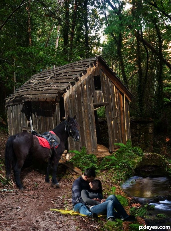
Thanks to mqtrf for the beautiful pics of the horse, river, ruins, and the couple.
(5 years and 3444 days ago)
4 Sources:
Modernity  by Akassa 9762 views - final score: 59.7% | Wookey Hollow  by Missy 10081 views - final score: 59% | autumn  by nanaris 11629 views - final score: 58.3% |
pride 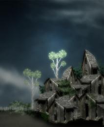 by dekwid 9427 views - final score: 56.2% | Jungle Rot 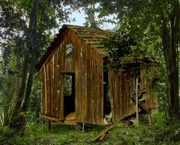 by MossyB 15440 views - final score: 55.9% | old painting 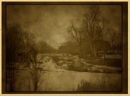 by kathyw 9891 views - final score: 55.3% |
We gotta move! 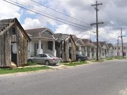 by layerstack 6863 views - final score: 54.3% | Beach Hut 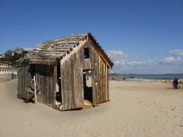 by layerstack 15774 views - final score: 54% | Old House Over the Hill 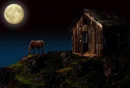 by George55 12392 views - final score: 54% |
nuke proofing 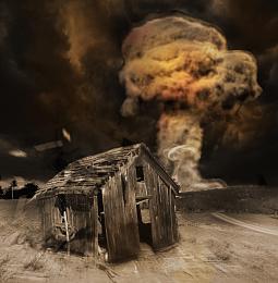 by mircea 9971 views - final score: 53.8% | Rickety path 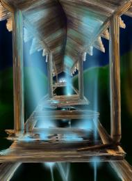 by marina08 5703 views - final score: 53.2% | Who's gonna drive you home ? 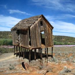 by greymval 13018 views - final score: 53% |
Haunted Cow 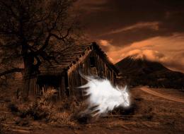 by MoNophian 10901 views - final score: 53% | The execution. 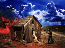 by Nickk 8415 views - final score: 52.9% | Forgotten 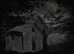 by birdhm 9761 views - final score: 51.8% |
"Good morning "  by shankarsadamate229 5935 views - final score: 51.8% | By The Old Shed 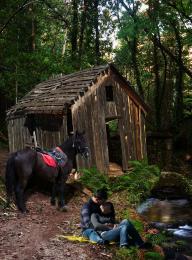 by George55 4965 views - final score: 51.6% | Sweet Retreat  by DigitalPro 5984 views - final score: 51% |
Old Waterfall Wheel House  by xwd 12084 views - final score: 50.4% | just reconstruct 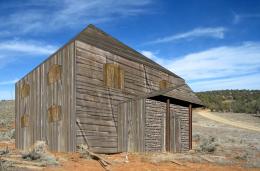 by ONabil 6064 views - final score: 50.2% | loneliness(oil painting) 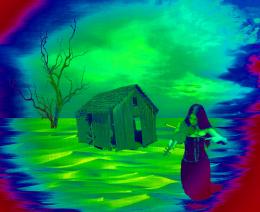 by hazem 8341 views - final score: 47% |
The Ark 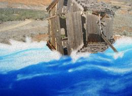 by Vautje 8261 views - final score: 46.8% | Lonely Blue Shack 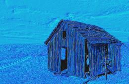 by MossyB 11195 views - final score: 45.6% |
Howdie Guest!
You need to be logged in to rate this entry and participate in the contests!
LOGIN HERE or REGISTER FOR FREE
Shadows are wrong, and too dark...you'd be better off without them. Looks good otherwise.
Thanks CMYK.... got rid of shadows....
Yep, better.
What, what? It looks better WITHOUT shadows?
The thing is there's an obvious shadow on the shed so..
Well at least you could try to burn under horsey or smth, but you know how to do a shadow, so place it under him.
If you could place those fern on top of the shed-layer by using masks, it would already look better. GL
I had to bring the shadow back.... I just lowered the opacity. I think greymval is right, there is a shadow on the shed, so, it should be a shadow by the horse and the couple. Hope it looks better.
Thanks again for suggestions and comments.... moved the shadow underneath the horse, and got rid of the couple's shadow.
Well i won't lie, it's not perfect, but the overall image has improved from the first time i saw it.
A lot of the blending is off but keep trying. You'll get it.
Thanks jawshoewhah.... I will.....
Howdie stranger!
If you want to rate this picture or participate in this contest, just:
LOGIN HERE or REGISTER FOR FREE