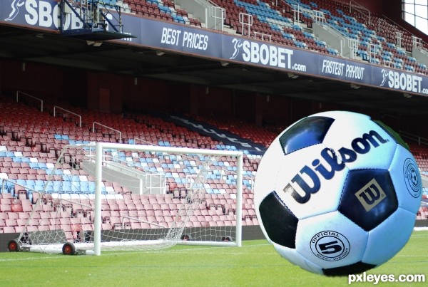
(5 years and 3444 days ago)
1 Source:
- 1: source1
I give up...  by ponti55 9459 views - final score: 62.2% | Snail  by derdevil 10452 views - final score: 58% | Lunch Time  by RickLaMesa 9009 views - final score: 57.9% |
Pixel Falls by RickLaMesa 10537 views - final score: 56.3% | on top of the lap top  by gustimusprime 13028 views - final score: 56.1% | super bicke 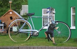 by DigitalPro 8267 views - final score: 55.9% |
Encaged Prophecy  by Lamantine 6930 views - final score: 55.5% | Morning Walk 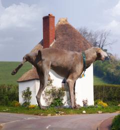 by RickLaMesa 8559 views - final score: 53.8% | ENORME  by lolu 4875 views - final score: 53.4% |
Abraxan  by Lamantine 8128 views - final score: 53.4% | My New Toy  by Lamantine 5688 views - final score: 52.8% | Spade 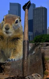 by filantrop 5125 views - final score: 52.5% |
Squirrelzilla 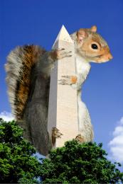 by taintedhockey 12538 views - final score: 52.4% | Oops.  by Giggles 5258 views - final score: 52.2% | It's really big!  by Valvaneda 6619 views - final score: 51% |
Daisy Picking 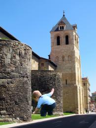 by junkieball 7146 views - final score: 50.8% | Swinging around history  by taintedhockey 9252 views - final score: 50.4% | Um?  by Milena 4363 views - final score: 50% |
I Can't Fit THAT! 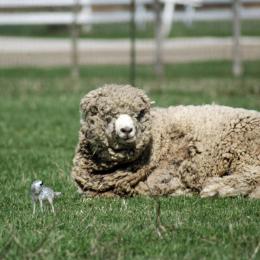 by digitalpharaoh 10739 views - final score: 48.2% | Need a smaller ball.. 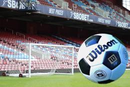 by layerstack 7480 views - final score: 45.7% |
Howdie Guest!
You need to be logged in to rate this entry and participate in the contests!
LOGIN HERE or REGISTER FOR FREE
The ball is not blended properly.. It is not a perfect sphere shape. On the bottom left it looks like you've missed a bit and like there is a dint in the ball.. Good luck though
Your right!! I should really go to bed!!
Looks like a normal perspective shot of the ball going towards the goal. Background small, foreground larger. That's how it works.
(Actually the background should be blurred a bit.)
Shading!!!!
Howdie stranger!
If you want to rate this picture or participate in this contest, just:
LOGIN HERE or REGISTER FOR FREE