(5 years and 3440 days ago)
I give up...  by ponti55 9452 views - final score: 62.2% | Snail  by derdevil 10442 views - final score: 58% | Lunch Time  by RickLaMesa 9000 views - final score: 57.9% |
Pixel Falls by RickLaMesa 10529 views - final score: 56.3% | on top of the lap top 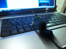 by gustimusprime 13018 views - final score: 56.1% | super bicke 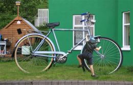 by DigitalPro 8261 views - final score: 55.9% |
Encaged Prophecy  by Lamantine 6921 views - final score: 55.5% | Morning Walk 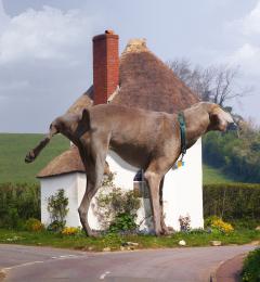 by RickLaMesa 8549 views - final score: 53.8% | ENORME 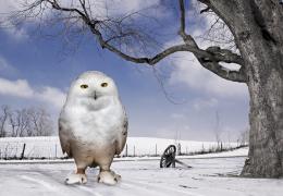 by lolu 4869 views - final score: 53.4% |
Abraxan  by Lamantine 8121 views - final score: 53.4% | My New Toy  by Lamantine 5681 views - final score: 52.8% | Spade 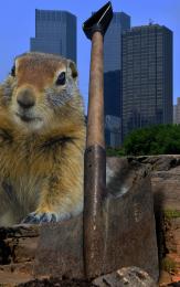 by filantrop 5118 views - final score: 52.5% |
Squirrelzilla 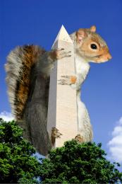 by taintedhockey 12518 views - final score: 52.4% | Oops. 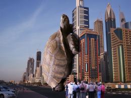 by Giggles 5251 views - final score: 52.2% | It's really big!  by Valvaneda 6612 views - final score: 51% |
Daisy Picking 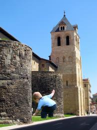 by junkieball 7140 views - final score: 50.8% | Swinging around history 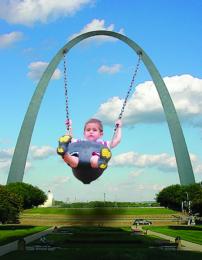 by taintedhockey 9245 views - final score: 50.4% | Um?  by Milena 4360 views - final score: 50% |
I Can't Fit THAT! 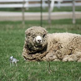 by digitalpharaoh 10721 views - final score: 48.2% | Need a smaller ball.. 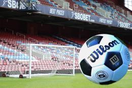 by layerstack 7474 views - final score: 45.7% |
Howdie Guest!
You need to be logged in to rate this entry and participate in the contests!
LOGIN HERE or REGISTER FOR FREE
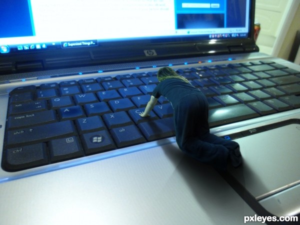
nice idea -- hand on the C key needs a bit of work as it looks like it is in the key not on it. -- wonder about the light as well maybe should be a secondary shadow from the light on the right
Edit -- looks better
hey alan thanks for the eagle eye, had a bit of a play with some new shadows and also did a (pretty dodgey) paint job for a hand correction
very interesting idea... and pretty well executed. love the shadow but the pixel difference between the person and the computer is kind of evident.. and perhaps try to select the person a little bit better because you can still see the white edge on the shirt!! but very interesting idea
Good one, i like it.
I like your concept but feel you miniaturized the person instead of supersizing the lap top. The coke can onto the right makes all the difference. Perhaps mask it out?
Nice concept. Would have been nice if you had lowered the C key seeing the person is pressing on it.
thanks every one. Solkee- i did attempt that but i never found a method that gave me a good result
Creative idea, but I have to kinda agree with jadedink, its more of a downsized image than a supersized image.
very very nice idea and cool work author...best of luck
Howdie stranger!
If you want to rate this picture or participate in this contest, just:
LOGIN HERE or REGISTER FOR FREE