THANKS A LOT TO:
http://luckystock.deviantart.com
(5 years and 3442 days ago)
Lemon Splash  by MoNophian 15820 views - final score: 59.7% | This Doesn't Make Sense  by apixeldot 17185 views - final score: 57.9% | you know i want cha  by rakib888 13253 views - final score: 56.8% |
Lemon B. Slimey 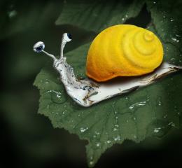 by Poss 12548 views - final score: 55.7% | Jug of Flames  by junkieball 12299 views - final score: 53.2% | Thirst  by layerstack 7618 views - final score: 53.1% |
My pet dolphins 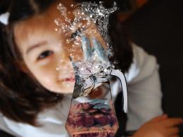 by layerstack 8256 views - final score: 52.4% | Hunt for the golden lemon 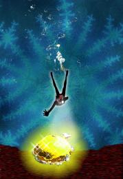 by sunilz 7957 views - final score: 51.8% | Dont drink me 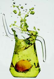 by Concrete 8103 views - final score: 51.4% |
A Fish Out of Water 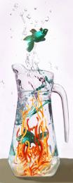 by artgirl1935 5999 views - final score: 51.2% | miss lemon splash 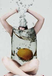 by rakib888 8023 views - final score: 50.4% | 1 second before lemon splash 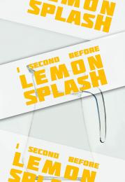 by jeanmarron 9392 views - final score: 47.6% |
Rejected Lemons 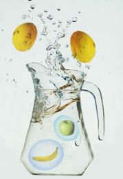 by themaije 7741 views - final score: 46.9% | Deep Sea  by birdhm 12815 views - final score: 46.5% | SAY NO 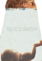 by DYNOSSAURUS 6363 views - final score: 43.7% |
Howdie Guest!
You need to be logged in to rate this entry and participate in the contests!
LOGIN HERE or REGISTER FOR FREE
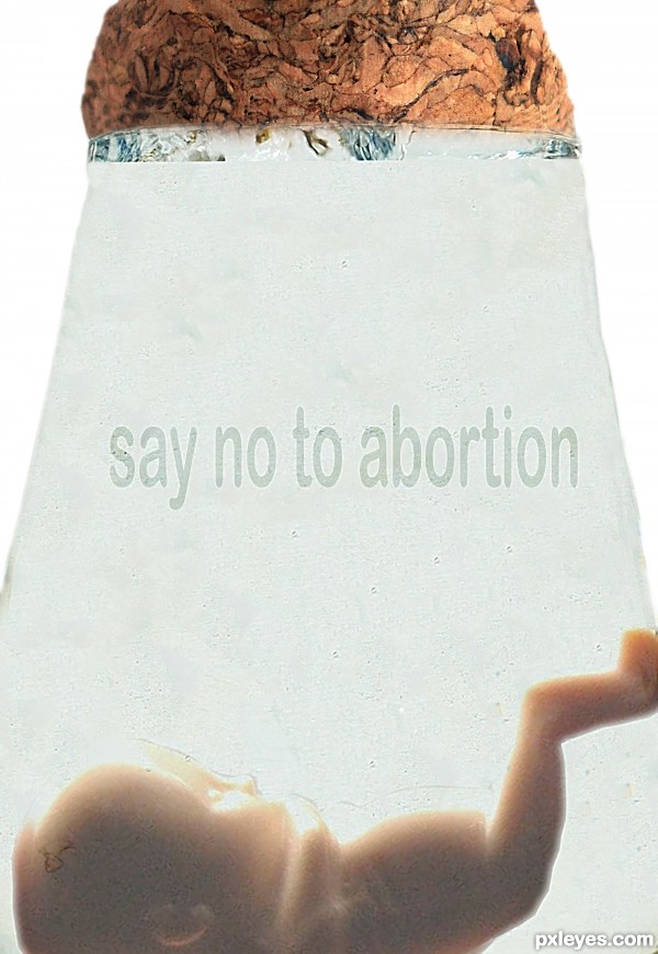
Personally I don't think there is anything bad about it. It's a step forward in the human race and knowledge. It's a personal choice that people make.. I know for a fact I would never do it but everyone has their own choice.

Coming back to the Photoshop side of things I think you managed to get your point across quite well. IMO maybe make the text stand out a little bit more or change the font. I don't know it just doesn't work for me. Good Luck!!!
I love posters telling me what to do !
I'm with CMYK..says it all...
Strong image, Author IMHO you'd better use capital letters. You could also add slight relief to the letters by means of pillow emboss. Good luck!
I would reconsider the entire image.. at the moment all i see is a fetus, a stopper that looks like brains and a weird grey light beam. It's a very deep thought with a strong message, but you have to think about what would fit in better with the given source. Maybe take the time to rebuild a new jug, or maybe use the glass to shape a pouch or a sphere to place the fetus inside.

Good luck
I don't believe in people that try to dictate to the rest of the world, but I won't stick you in a jar!
I see nothing of the original source in this image. Bad photoshopping, grainy, stretched and makes no sense to me.... if you are going to be anit-abortion then make a clearer image and spend some time on it to prove you believe in your own words....
Freedom of choice, freedom of women, freedom to live or die......... my freedom is not your freedom!
What about the baby's right to live? Maybe you should have used a fetus with its skull crushed in. I guess it makes it easier to pull the dead baby's corpse out. See that? I made a statement about the image AND the statement at the same time!
I believe in your message but the photoshopping REALLY needs work, especially toward the top.
I can't help but think people are 'fav' the message but not the way you have photoshopped the content of the comp. ?? Each too their own i guess....
oH my!
Yikes, well you sure are getting a lot of buzz about this, but not really for the right reasons. Photoshop first, and then see if it portrays your message. We get the message but only from what the title says, but the actual image needs work, and that is what this site is about first and foremost.

So about the image, the only thing I see from the source is a bit of water at the top and the shape of the jar, and that isn't really photoshopping the source image. So I agree with Ponti55. Just a few suggestions for future references is all
Howdie stranger!
If you want to rate this picture or participate in this contest, just:
LOGIN HERE or REGISTER FOR FREE