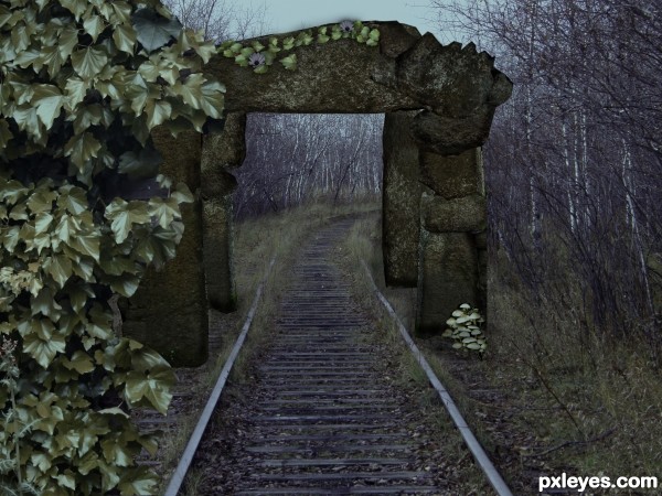
(5 years and 3444 days ago)
6 Sources:
- 1: source1
- 2: source2
- 3: KeRmo (Thank you)
- 4: source4
- 5: Rbut (Thank you)
- 6: source6

(5 years and 3444 days ago)
Lament  by ponti55 12217 views - final score: 64.4% | Sock Monkey  by Chalty669 11742 views - final score: 61.5% | Happy Holidays Pxleyes!  by JPDesigns 11816 views - final score: 56.8% |
Monolithic 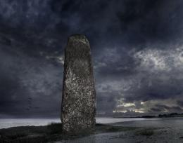 by digitalpharaoh 8062 views - final score: 56.7% | The Sword in the Stone 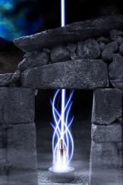 by KunkleDesigns 9951 views - final score: 55.5% | Slum Entrance 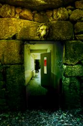 by Toothpick134 7066 views - final score: 55.1% |
Goren Of The Stone 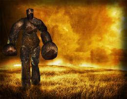 by Lamantine 5321 views - final score: 53.7% | Forbidden_Path 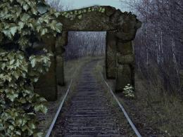 by mishti 6307 views - final score: 53.6% | Which way you gonna run! 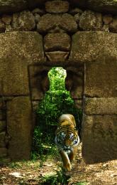 by layerstack 7100 views - final score: 53% |
Stone Man Ported 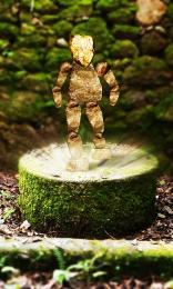 by PSA2009 5268 views - final score: 50.9% | Remembering... 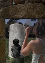 by Disco 3284 views - final score: 50.5% | Gateway to Heaven 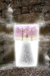 by taintedhockey 7644 views - final score: 48.1% |
Howdie Guest!
You need to be logged in to rate this entry and participate in the contests!
LOGIN HERE or REGISTER FOR FREE
You need to play with the lighting and colouring of this image a bit more author. The stone arch looks too green and saturated against the rest of the image.
Maybe bring the colours of the background out more, or add a little contrast to it even
Goodluck.
For me...and only speaking for me...the lion head is a tad distracting. Doesn't seem to blend in enough with the "gateway". Also, watch your masking. There are a couple of places that could be cleaned up a little. Other than that, good concept.
Love what you are trying to do author! IMO you need to play with the perspectives of the various layers so they blend a little better....Best of Luck
I like your idea.... good luck...!
Howdie stranger!
If you want to rate this picture or participate in this contest, just:
LOGIN HERE or REGISTER FOR FREE