(5 years and 3440 days ago)
2 Sources:
I give up...  by ponti55 9459 views - final score: 62.2% | Snail  by derdevil 10452 views - final score: 58% | Lunch Time  by RickLaMesa 9010 views - final score: 57.9% |
Pixel Falls by RickLaMesa 10537 views - final score: 56.3% | on top of the lap top 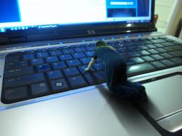 by gustimusprime 13028 views - final score: 56.1% | super bicke 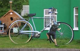 by DigitalPro 8267 views - final score: 55.9% |
Encaged Prophecy 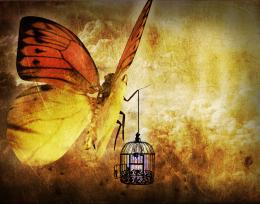 by Lamantine 6930 views - final score: 55.5% | Morning Walk 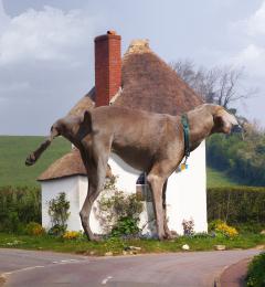 by RickLaMesa 8559 views - final score: 53.8% | ENORME 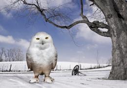 by lolu 4875 views - final score: 53.4% |
Abraxan 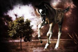 by Lamantine 8128 views - final score: 53.4% | My New Toy  by Lamantine 5688 views - final score: 52.8% | Spade 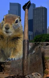 by filantrop 5126 views - final score: 52.5% |
Squirrelzilla 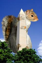 by taintedhockey 12538 views - final score: 52.4% | Oops. 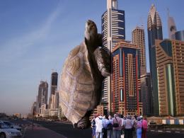 by Giggles 5258 views - final score: 52.2% | It's really big! 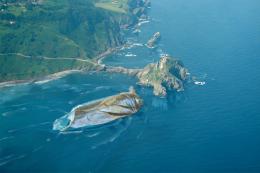 by Valvaneda 6619 views - final score: 51% |
Daisy Picking 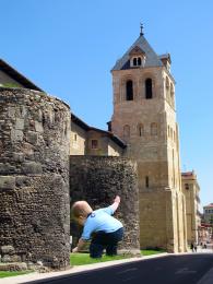 by junkieball 7146 views - final score: 50.8% | Swinging around history 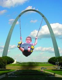 by taintedhockey 9252 views - final score: 50.4% | Um? 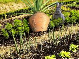 by Milena 4363 views - final score: 50% |
I Can't Fit THAT! 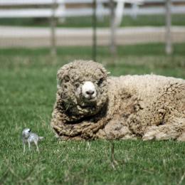 by digitalpharaoh 10739 views - final score: 48.2% | Need a smaller ball.. 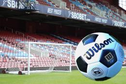 by layerstack 7480 views - final score: 45.7% |
Howdie Guest!
You need to be logged in to rate this entry and participate in the contests!
LOGIN HERE or REGISTER FOR FREE
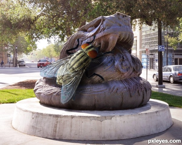
Great entry. Perhaps the fly could stand out from the statue more though? I actually missed it on first glance. GL author
The fly needs a shadow.
Don't change a thing! The fly is perfect, in that it DOESN'T jump out at the eye. Flies are like that when they are "normal" sized.
The fly has a shadow on the statue. Possibly a bit more for the bottom of the wing on the right, but otherwise the perspective is spot on.
I especially appreciate the translucence of the wing on the left, showing the road behind it.
This is delightfully "icky!" The only way it could have been better would have been if the statue was a stone hamburger or something. Very nice work!
There is a bluish fringe where it hasn't been extracted from the source image properly... and there's also an issue with light direction and the 'footing' of the fly on the statue... other than that, it does need a shadow but more a 'profile' added to the shadow being cast on the floor...
EDIT: the flys shadow would actually need to be profiled on the shadow being cast on the first flat surface... not the floor...
Ha, fitting, that statue does kinda look like poo at first glance, is that why you titled it Lunch Time? hehe. Good idea!
Fantastic! Well done. Fav from me!! GL
Creepy fly!
very nice detailed work...gl
Congrats for your third place, Rick!
And congrats to you too!
Congrats to you
Congrats...
Congrats...
Congrats!!
Howdie stranger!
If you want to rate this picture or participate in this contest, just:
LOGIN HERE or REGISTER FOR FREE