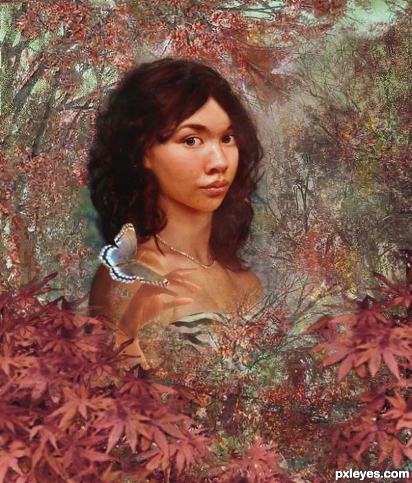
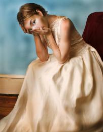
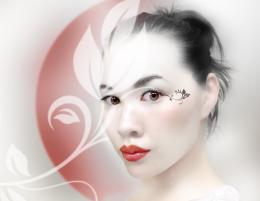
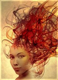
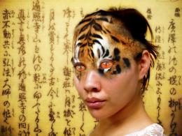
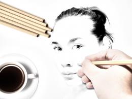
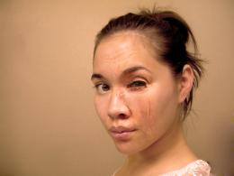
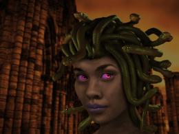
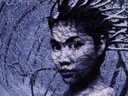
I have edited this with different background sources, since there was a question about my original source. My apologies to those who have already voted. Thanks to the following at flickr.com: Gabriella Cameratti for the hand; also, to katmystiry at morguefile.com for the butterfly; thanks also to Shemantic Shift at flickr.com for the trees in background. (5 years and 3430 days ago)




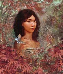


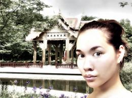



Great blend, Author . You could put her butterfly hand lower - navel size -so it would seem more natural , and remove the second one. Just try and see if it looks better.
your second source image is questionable...
Thanks, James. I have changed the background, not knowing for sure about my first source. I think it was just a photo, but with chances that someone might have manipulated it, I decided to do it over with a different source.
I like her hair = )
It looks like those Renaissance paintings... I love the Autumn colors of the maples!
I agree with erikuri ... has a very "painterly" feel to it. Lovely!
very nice work author...there is few issues around the hair but overall look is well made...gl
Howdie stranger!
If you want to rate this picture or participate in this contest, just:
LOGIN HERE or REGISTER FOR FREE