Credits to :
Source 1 : Accent
Sources 2 and 3 : CGTextures
Source 4 : latebraking
Source 5 : Dustin Maretz
Source 6 : ^FantasyStock
(5 years and 3428 days ago)
Follow The White Rabbits  by ponti55 15012 views - final score: 62.8% | Jackalope  by RickLaMesa 17709 views - final score: 60.3% | Enjoying moon light  by AdhirAnimator 15226 views - final score: 57.6% |
Insane bunny world 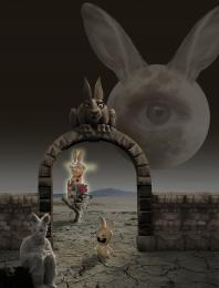 by CMYK46 15672 views - final score: 56.5% | Werebeings 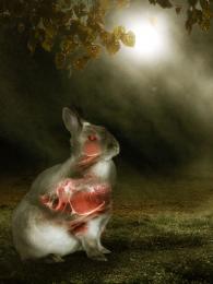 by Lamantine 7350 views - final score: 53.5% | Lost Treasures 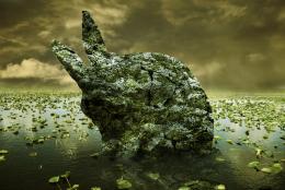 by Lamantine 5197 views - final score: 51.3% |
Bunny_World 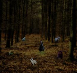 by mishti 5250 views - final score: 50% |
Howdie Guest!
You need to be logged in to rate this entry and participate in the contests!
LOGIN HERE or REGISTER FOR FREE
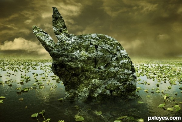
very interesting take on the theme.. (You may want to go around the edge of the bunny with a soft blur brush to get rid of the choppy edge (It's super noticeable in high RES and you know how some of the voters get about that nit picky stuff)... a little burn highlight tool set super soft to enhance the shading to give a stronger 3d effect might be helpful as well ... (very clever idea and good luck)
great idea but try to work on the edge of the bunny.. GL
Agrees. It seems like some shading in areas might help you get more depth. It just seems a little flat. GL!
DUDE!!! 48 FRIKIN' STEPS? you're a hero! I get that you want to make it a tutorial right away , but you have to improve it:
-place some shadow/ highlight layers ( use that original bunny to know where to paint), cause people & I think this is flat. Work ESP. around the right side of the HEAD, you must make sure it stands out.
- the edges suck, but the thing is you can' t make them smooth since this is a ROCK, not a sculpture.. right? so you must make the shape irregular like a natural stone.
- reflection is a bit forced.. see what DisMap gives you.
-And i don't get what the "cover it all in ivy" step, gets me? it looks pretty much the same without it. You can get a better stone effect with clouds & mezzotint like in that stone wall tutorial ( lunacore or smth).
Anyway keep it up, you're good with colors which is a big thing!
It would be great with a bit more of shadows and depth for the rock
very nice work...gl
Howdie stranger!
If you want to rate this picture or participate in this contest, just:
LOGIN HERE or REGISTER FOR FREE