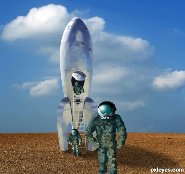
Visitors from the planet of the Sponge People. :) (5 years and 3435 days ago)
3 Sources:
My Friend "Squatch" 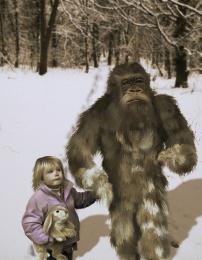 by Geexman 8140 views - final score: 59.2% | Burning rage 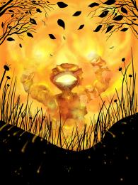 by marina08 8714 views - final score: 56% | The Gift Exchange  by artgirl1935 12715 views - final score: 55.9% |
Take us to your leader  by CMYK46 10336 views - final score: 54.8% | The Abominable Spongeman 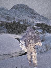 by taintedhockey 8954 views - final score: 50.4% | snowy dino warrior  by bingbong088 7595 views - final score: 49.5% |
Howdie Guest!
You need to be logged in to rate this entry and participate in the contests!
LOGIN HERE or REGISTER FOR FREE
I like it, nice job on the helmet visor.
made me smile i like it. not sure about the guy standing in the distance tho with him being an exact copy of the the guy in the foreground, maybe flip him horizontally or move an arm or something. might look good still without him.
edit ..actualy i like how it looks like there marching out one by one might not look as good without him
The lighting is wonky. The ship is lit from the upper back, while the helmet shows an upper front light source, and the sponge man under the helmet shows no real light source at all on his shoulders... The shadow of the spaceship should be more to the right, and the base of the ship needs to show highlights more than reflections, particularly the LH side.
The duplication of the sponge spacemen is also too obvious, with the poses too similar, with the lighting problems at the base of the ship emphasized by the "cookie cutter" spongeman placement.
Mossy: Look at the source pic of the rocket. Then look at the shadow on the hatch. This gives you the angle of the sun. If anything, the ship's shadow could be rotated a bit more clockwise. If you compare the sponge guys to the original you'll find quite a bit of highlights on the lit side, and corresponding shadows on the other. Sponges don't exactly reflect a lot of light, know what I mean?

As for the highlights on the visors, they may not be exactly correct, but they look way cool.
i think you should get rid of the lighting on the helmet of the guy getting out... hes in the shade...
Taintedhockey, thanks, I agree...toned down his highlight, and also darkened some light areas on the foreground figure so he's not exactly like the background guy.
Good one!
Helmets. Are. AWESOME.
Good luck!
very cool construction author...best of luck
Howdie stranger!
If you want to rate this picture or participate in this contest, just:
LOGIN HERE or REGISTER FOR FREE