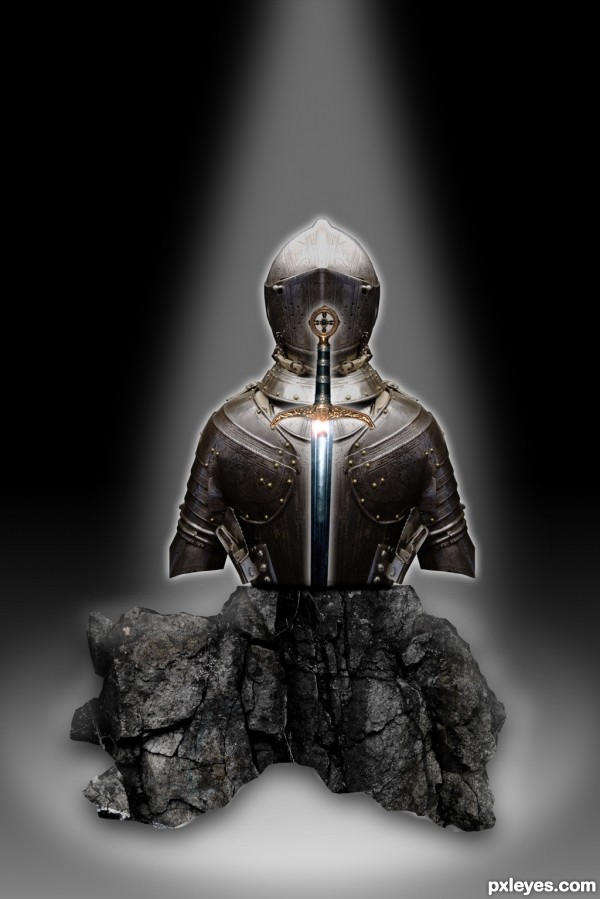
Knight in shining armor and the sword in the stone that defeated him, now set in a display (5 years and 3431 days ago)
3 Sources:
Make Face  by nilknarfsoive 14758 views - final score: 60% | shoes  by smalapatekut 14279 views - final score: 59.8% | I Am Kinght  by layerstack 8245 views - final score: 57.5% |
Motor Heads  by xwd 15881 views - final score: 55% | The Hidden Treasure 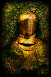 by ChristianDarmali 10170 views - final score: 54.2% | AMOUR SUIT 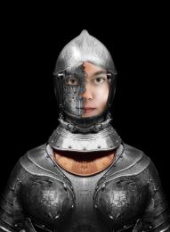 by lolu 7376 views - final score: 53.9% |
Face 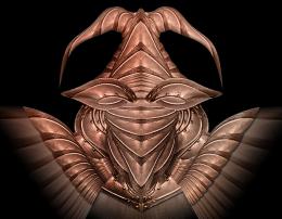 by lahiripartha 3823 views - final score: 53.9% | Past & Present 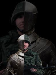 by birdhm 10116 views - final score: 52.7% | Knight in shining armor  by contay 11966 views - final score: 51.8% |
Wooden armor 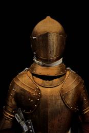 by Syntek 13287 views - final score: 49.6% |
Howdie Guest!
You need to be logged in to rate this entry and participate in the contests!
LOGIN HERE or REGISTER FOR FREE
It lacks a bit of depth and shadows on the side of the rock, but the idea is excellent and nicely executed.
You could have extended the arms downward to go behind the rock. (You still can...). I don't think they had short sleeved armor back in the day.
Also, the glow around the sword should be different than the glow around the armor to help it pop.
Thanks for the feedback fellas. I cant get the arms extended, and it be the quality I like. It just becomes a pixelated mess, and throws the rest off.
Thank you both very much for your critique, and I will try harder on the next contest.
Thanks for the feedback fellas. I cant get the arms extended, and it be the quality I like. It just becomes a pixelated mess, and throws the rest off.
Thank you both very much for your critique, and I will try harder on the next contest.
You know you can edit your entries until the contest closes right?
IMO, you lack background, I know it's extra work ( and my least favorite part of chopping) but it adds a great effect, why not try some paved stone on the floor and placing the scene in a catacomb, ruins, cracked earth, on a hill with mountains around -I'm brainstorming right now.
Yeah I know. Call me lame or any other name that you would like. maybe I'm over the top in my line of thinking but I feel that I should stick with my original submission the way I submitted it. Believe me this isn't because I don't value the critique because I treasure it. It's exactly why I compete. Back to my point though I feel that I learn a greater lesson if I suffer the consequences now instead of constantly retooling what I have already presented. I feel I should have taken these things into account before I presented. They are all great observations/ suggestions and I wished I would have thought of them myself. You better believe I will on the next one. That's for dang sure.
I was actually thinking of placing it in a museum I just couldn't ever reproduce what I was envisioning. I will learn with time and the great feedback that I get here.
It's cool author, no one's calling you lame, and you have some nice adult-ish arguments there, with which I don't totally agree, lol.
Yeah I can see both sides of the argument, take the advice, improve it, win. You know what I might start a thread in the forum after the contest has finished because I would really like to hear all the views on it. Maybe I am out of line in my stead fast and most likely over the top manner of competing.
Howdie stranger!
If you want to rate this picture or participate in this contest, just:
LOGIN HERE or REGISTER FOR FREE