credits to:
eirian-stock
resurgere
monicaoldenburg
faestock (5 years and 3429 days ago)
Lover's Magic  by IDt8r 14283 views - final score: 61.1% | Grave Relics  by sophia 12124 views - final score: 58.5% | both sides  by dekwid 7874 views - final score: 58.3% |
Fields of Daydreams  by jadedink 10524 views - final score: 58.3% | Linked By Chains  by Lamantine 12603 views - final score: 56.8% | Almost There 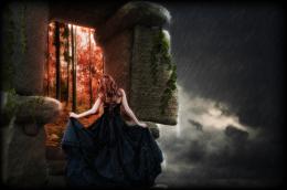 by fatz8016 7226 views - final score: 56.6% |
Alone 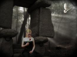 by erikuri 4683 views - final score: 55.8% | The Son of Knock  by Drivenslush 5871 views - final score: 55.3% | A Summer Night 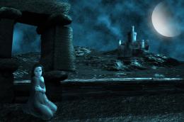 by George55 5873 views - final score: 54.8% |
The magical sword 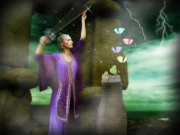 by erikuri 6868 views - final score: 54.6% | Worlds  by marina08 4394 views - final score: 54.5% | Hunters  by shankarsadamate229 5387 views - final score: 54.3% |
Gate  by filantrop 4403 views - final score: 52.4% |
Howdie Guest!
You need to be logged in to rate this entry and participate in the contests!
LOGIN HERE or REGISTER FOR FREE
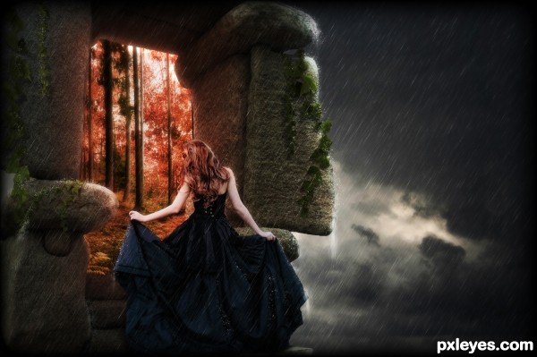
The dry hair in a pouring rain looks a bit weird...
Thanks for the feedback MossyB..good observation..made some changes to the hair.
This is some awesome work, check the rain/ water details in hi-res folks. .
.
You could experiment a bit with the blending of that girl. I get that you wanna make her like she's transforming as shes passing through, but IMO her back side should still be desaturated and overlayed with green-ish, the colour of the environnement.
EDIT: now that i changed the screen i realize that it was not green-ish, but you get the idea, she needs some desaturation and some lower brightness on her back,hair&hands,try with some level overlay.
PS: I DON'T usually make comments behind a messed up PC screen ,.
Pure beauty...
Looks so nice.... good luck... I like the colors.
Thanks for the comments..at greymval, i had tried removing the blues and cyans from the dress, but when i did that it made the dress too desaturated and it removed any depth that the model has with the stone structure and it felt too flat..so i left it with that little bit of blue..thanks for the comment tho, good suggestion
I like this, the only thing I might have done differently is the color of the forest she is walking in to. It looks too red and it makes me think of fire.
very very good work author...love the model...best of luck
Howdie stranger!
If you want to rate this picture or participate in this contest, just:
LOGIN HERE or REGISTER FOR FREE