Thanks Melissa Schalke, steampirate (5 years and 3409 days ago)
Lover's Magic  by IDt8r 14262 views - final score: 61.1% | Grave Relics  by sophia 12107 views - final score: 58.5% | both sides  by dekwid 7864 views - final score: 58.3% |
Fields of Daydreams 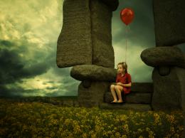 by jadedink 10504 views - final score: 58.3% | Linked By Chains  by Lamantine 12570 views - final score: 56.8% | Almost There 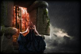 by fatz8016 7207 views - final score: 56.6% |
Alone 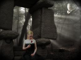 by erikuri 4675 views - final score: 55.8% | The Son of Knock  by Drivenslush 5854 views - final score: 55.3% | A Summer Night 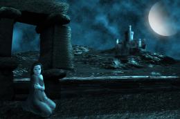 by George55 5859 views - final score: 54.8% |
The magical sword 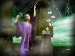 by erikuri 6844 views - final score: 54.6% | Worlds 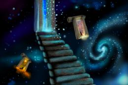 by marina08 4380 views - final score: 54.5% | Hunters 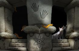 by shankarsadamate229 5370 views - final score: 54.3% |
Gate 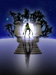 by filantrop 4386 views - final score: 52.4% |
Howdie Guest!
You need to be logged in to rate this entry and participate in the contests!
LOGIN HERE or REGISTER FOR FREE
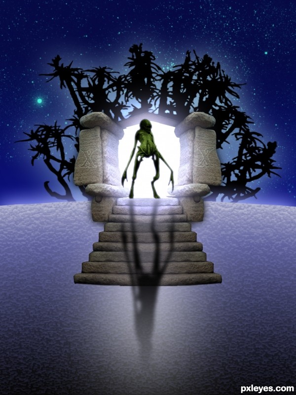
The creature doesn't look backlit, and the shadow should conform to the contours of the steps, as well as have more edge blur and maybe a bit less opacity.
Thank you for the help.
Good work with the portal.
The background looks unconvincing. Folks here use vegetation rocks or premade background to make the environnement look realistic.
Use imageafter.com and sxc.hu to find blendable stock.
It looks ok, but I think you should have used other kind of plants or background as greymval says... and the foreground is not convincing for your kind of work. The alien looks cool. The rocks.... look ok. Good luck author.
Howdie stranger!
If you want to rate this picture or participate in this contest, just:
LOGIN HERE or REGISTER FOR FREE