All photos besides the main source are taken by me. (5 years and 3415 days ago)
Metempsychosis of Magritte  by ponti55 20418 views - final score: 61.8% | the flutter of love..  by dekwid 12180 views - final score: 61.6% | Waiting For Something  by fatz8016 41923 views - final score: 61.3% |
Weather Man 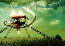 by yoguy108 16541 views - final score: 58.9% | holoman 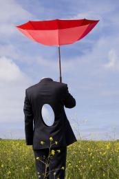 by steed 15386 views - final score: 58.4% | Drostistic 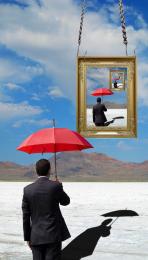 by jawshoewhah 5744 views - final score: 57.5% |
Save Water 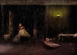 by Siddhartha 8141 views - final score: 57.5% | Sublimely Surreal 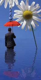 by jessica82 7825 views - final score: 56.2% | The Day After Tomorrow 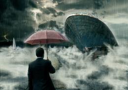 by dreamboy 22556 views - final score: 56% |
Flying girl....... 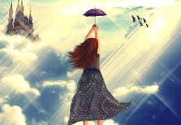 by nishagandhi 12277 views - final score: 55.9% | Bugs Life 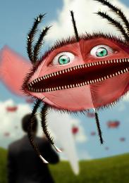 by yoguy108 5043 views - final score: 55.7% | Tornado Attack 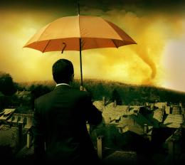 by ChristianDarmali 7857 views - final score: 55.5% |
On the way To Santa...  by shumigumi 8142 views - final score: 55.3% | stormy sea  by Se7eN0f9 12124 views - final score: 54.5% | First time with her  by genex 8549 views - final score: 53.8% |
Why So Serious ??? 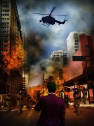 by ChristianDarmali 6752 views - final score: 53.7% | Teacher 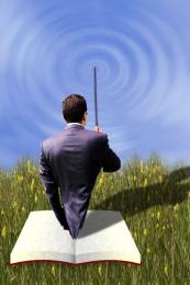 by xycrome 7555 views - final score: 53.4% | Afloat 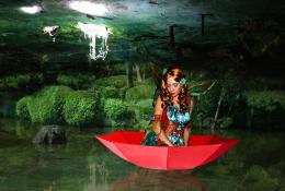 by TwilightMuse 6340 views - final score: 52.8% |
alone . . . .  by steed 4944 views - final score: 52.7% | Peace... 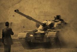 by layerstack 5480 views - final score: 52.6% | Tears Dried by Hand  by Drivenslush 7255 views - final score: 52.6% |
Protecting Liberty  by Disco 4596 views - final score: 52.5% | Wedding Dress  by CrystleClear 6727 views - final score: 52.3% | The Institution 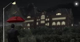 by birdhm 6241 views - final score: 52% |
Flying  by TwilightMuse 6539 views - final score: 51.3% | NEVER HOT LIKE THIS BEFORE  by ChristianDarmali 10194 views - final score: 51% | old sh*t  by Boozor 4715 views - final score: 49.7% |
Howdie Guest!
You need to be logged in to rate this entry and participate in the contests!
LOGIN HERE or REGISTER FOR FREE
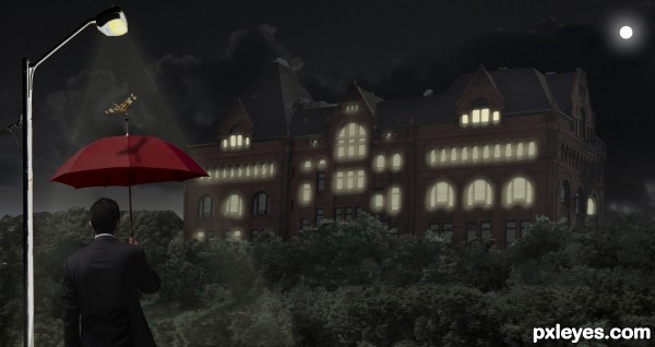
If you want to make it like night time you should select some windows and make it glow like the light is on in that room. There are some tutorials online about night time.
You could also introduce a lighting pole that would bring out the guy with the umbrella, so that we can see him in contrast with the rest of the image. Just have to be carefull where you place it.
Thanks graymval, I gave a shot. Any better?
IMO it's still too dark even in high res...I'm going to wait to vote and check back....Best of Luck
Well you got the idea author, but you could make those lights yellow, and placed randomly, not just on the top windows. Also add a glow to them , double click on layer = layer style, click outer glow, adjust setting in that pannel.
Same thing for the light pole + you might have to make a new layer on top and use a yellow brush to drag light lines from the lamp and then make them transparent, screen or overlay and blur.
I strongly suggest to search some tutorials out there, in case my explanations are not helpfull enough.
Added some more windows & glow. Also added a moon. Better I hope. : )
First of all author, you should be proud for giving yourself a prety hard mission for a beginner.
Although not perfect, i consider this an improvement and I hope the voters will appreciate your efforts & patience. Be sure I do.
The most critical adjustments that i consider you should do at this stage:
1.Make those edges clean! Light pole,umbrella man, left side forest & left side building need adjustments.
Check this tutorial here and use Pen tool to repair them :
http://www.youtube.com/watch?v=AGVsn-X2GxI
2. When you put the light at a window near the edge of the building you must put light on the side of the building as well, it's logical. Rooms on corners are usually square, and have windows on two sides so when the light is up it should be seen on both sides.
Keep it up, you're doing good.
Thanks graymval, you have been a great help. I will try to fix these items, it tuff work.
Gave it one more try, added a light beam on light pole, and cleaned it all up a bit. Hope you guys like this one better.
good work, but i think the glow is still too unrealistic
Just too dark in overall gamma. Cannot clearly make out the castle, while the foliage is a bit too light.
Howdie stranger!
If you want to rate this picture or participate in this contest, just:
LOGIN HERE or REGISTER FOR FREE