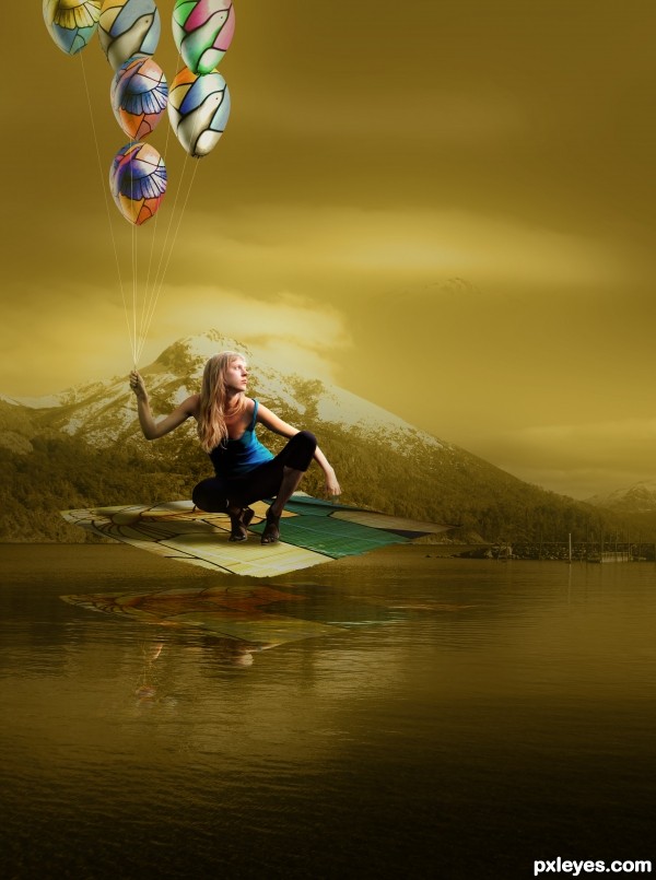
Thanks to sxc.hu &
Luciano Brasil Perottoni for 'Mountain in Bariloche',
foxumon for 'The unfurled bamboo mat',
Belovodchenko Anton for 'The girl poses on ruins'. (5 years and 3411 days ago)
Featheries  by CorneliaMladenova 10059 views - final score: 62.3% | Window of Light  by layerstack 12492 views - final score: 59.6% | In the Dream  by shankarsadamate229 13364 views - final score: 57.5% |
through my kaleidoscope eyes  by spygirl1978 13949 views - final score: 57.5% | Firebird  by ChristianDarmali 15459 views - final score: 57.4% | Flying High  by George55 5646 views - final score: 57% |
Quest For Peace  by George55 7550 views - final score: 56.7% | The Book Of ... 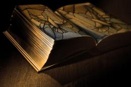 by Arryko 14465 views - final score: 55.8% | Free Fly 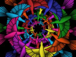 by xycrome 8358 views - final score: 55.7% |
Broken 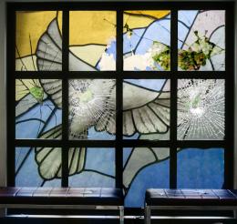 by Syntek 10919 views - final score: 55.7% | Come to life 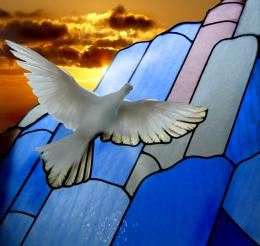 by blaine2nd 4659 views - final score: 53.6% | The 6 Titans  by nilknarfsoive 10217 views - final score: 53.1% |
Driven by Art  by sunilz 5927 views - final score: 49.3% | Fashion  by shankarsadamate229 4394 views - final score: 49.2% | Window and World are One  by GrantReynolds 7164 views - final score: 48.8% |
Abstract  by Ory 4135 views - final score: 45.8% |
Howdie Guest!
You need to be logged in to rate this entry and participate in the contests!
LOGIN HERE or REGISTER FOR FREE
Definitely different but perhaps there should be a reflection? ?
?


But the DOF you've created with the balloons is quite stunning! They really pop out at you.
Good idea. Might be better if you flipped the background so the light matches the light on the balloons & figure.
Nice, interesting image...but as jawshoewhah suggests.... a reflection would be good. Good luck!
The lack of reflection is the biggest flaw here.
Other than that, this has a very surreal feeling and the balloons have a nice depth and shape.
Nicely done.
Reflection for object above the water is more difficult, tricky is a better word, than those near the water. You'll have to be carefull when calculating it. Good luck.
The balloons are truly amazing! Good work!
Love the mood author so much and this is really unique idea...With few tweaks u could get high marks at the end...try to create something like light source on right side of the sky to match with lighting on the girl...for that u could use ordinary black layer,then add lens flare an position them on top right corner and after that change blend mode to screen.With that u have your light source and with opacity slider adjust the density...Also shadow under the girl is ok but she looks like floating,and to avoid that just add dark slight shadow directly under her feet. if u use CS5 u could with puppet warp modify carpet a bit too look a bit more curvy...Again this is only ideas...Best of luck author
Very pretty!
i love it, good luck!
You probably set the reflection back a little too far. I'm thinking it would be a lot lower. My best suggestion would be to find a photo with similar subject, even a low flying seagull or plane and see where the reflection is. Here's one I just found::

http://martybugs.net/gallery/photos/IMG_12077_600.jpg
You see how the reflection of the birds is in comparison. It's a useful trick when you just can't quite make something look right. I'm till impressed with the balloons! I think focusing on the balloons more in this entry would have been you best bet because of the depth you created.
Thanks your cheerful comments all of you guys ! I am learning from your comments. Thanks again !
Love the concept and the originality. I agree that the reflection is a hard one on this. Not sure if you would see the girls face at that angle but it is pretty cool and I would be inclined to accept some Artistic License on that. I can't begin to figure out how to work reflection with out a 3d method and I can't do 3D so I am hopeless. I have floated thing in water, beside water and above water but it is never the same as a true model.
You have done very well here IMO!
I LOVE those balloons!
Lovely, but too yellow; makes it bileous looking
Hey! Congrats on 3rd!
Congratulations! Very nice work!
Congrats my friend!
Congratulations for your third place. Your entry was one of the best you have done. Keep it going... You are doing just fine...
congrats!
Congrats for 3rd
Howdie stranger!
If you want to rate this picture or participate in this contest, just:
LOGIN HERE or REGISTER FOR FREE