(5 years and 3401 days ago)
Race  by filantrop 10005 views - final score: 58% | Snapshots  by Geexman 10891 views - final score: 57.9% | Framing Nature  by Geexman 12239 views - final score: 57.6% |
Beer me!  by migue1ito 9036 views - final score: 56.5% | Smart move 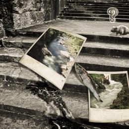 by Cicist 13131 views - final score: 55.5% | Water falls 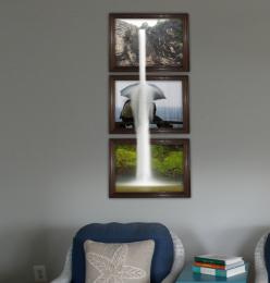 by migue1ito 6207 views - final score: 55.2% |
A Little Help From The Fae 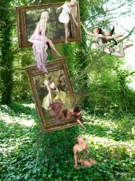 by TwilightMuse 16760 views - final score: 55% | C U Tomorrow... Alice!  by genex 8997 views - final score: 54.9% | tug of war 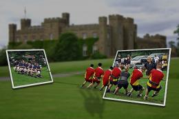 by Se7eN0f9 6252 views - final score: 54.3% |
Try to catch 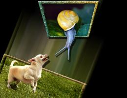 by lahiripartha 6647 views - final score: 54% | Big wave. 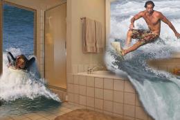 by filantrop 7929 views - final score: 53.9% | Skydive 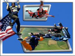 by filantrop 4473 views - final score: 53.1% |
Soooooo tempting! 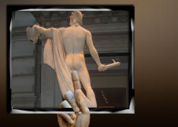 by Disco 7894 views - final score: 52.8% | fishing 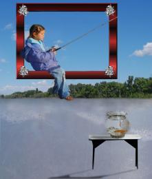 by Se7eN0f9 5321 views - final score: 52.7% | No! 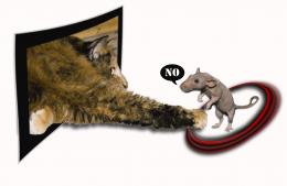 by birdhm 5554 views - final score: 50.9% |
Howdie Guest!
You need to be logged in to rate this entry and participate in the contests!
LOGIN HERE or REGISTER FOR FREE
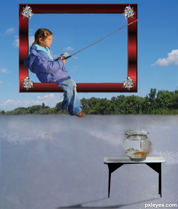
Nice idea but I think you have to include another frame. The table looks like it's floating anyways.
Do this: put a frame around the table and fishbowl and since this is a surreal type of contest anyways, why not just put a "cloudy sky" layer in the background. Then the table wouldn't matter if it was floating. Just a suggestion. GL!
i dont think there needs to be another frame in it jaw, aslong the images are connected to eachother, look at he sample they gave
i agree with jaws
i think the picture will really look better with a different background
and you indeed don't have to add a second frame but i think i'd be nicer
in case you ain't gonna follow this advise you may as well distort the painting frame so it is in proportion with te wall
GL
The fishbowl is at a weird perspective angle compared to the rest of the image, the table, the boy, etc. It looks like is it tilted up towards the viewer.
ok changed the fishbowl it indeed looked weird thx for he comment
Fantastic concept author...best of luck
Howdie stranger!
If you want to rate this picture or participate in this contest, just:
LOGIN HERE or REGISTER FOR FREE