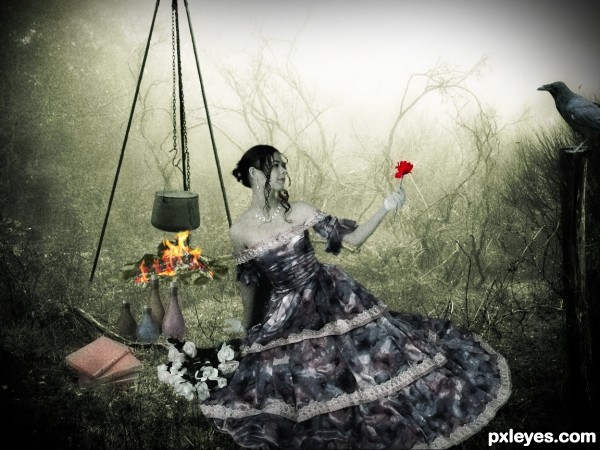
All the magic and all the potions for...
Thanks to:
- Vasiliy Koval @ Photoxpress;
- hisks and lusi @ RGBStock;
- linder6580 and mordoc @ Sxc.hu. (5 years and 3403 days ago)
Not So Civil 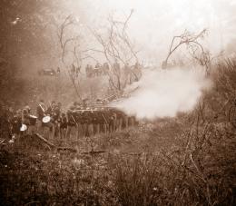 by pingenvy 12015 views - final score: 59.7% | the finder the keeper 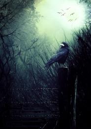 by dekwid 9517 views - final score: 58.5% | Conflict zone 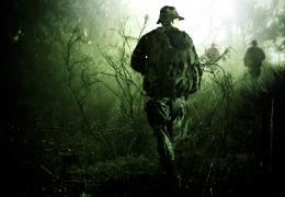 by genuine2009 13183 views - final score: 58.5% |
The Encounter 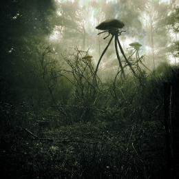 by lchappell 8854 views - final score: 57.7% | The Protector 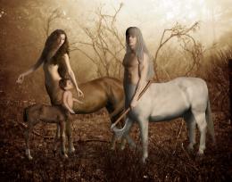 by IDt8r 9742 views - final score: 57.5% | Early Morning Portage 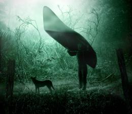 by artgirl1935 7203 views - final score: 57.3% |
Forlorn 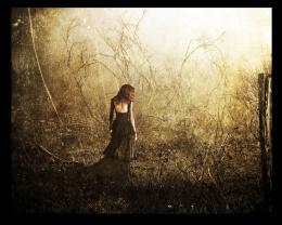 by Lamantine 7135 views - final score: 56.4% | The Buddha Interview 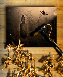 by Drivenslush 7843 views - final score: 53.6% | The ritual 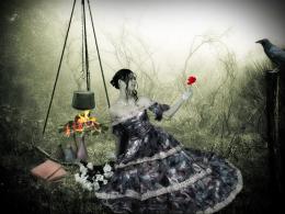 by erikuri 8420 views - final score: 52.7% |
The Arrival 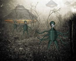 by George55 4359 views - final score: 52.6% | Cold morning 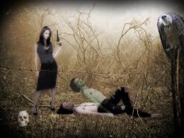 by erikuri 4827 views - final score: 51.4% | Big Bird Dark 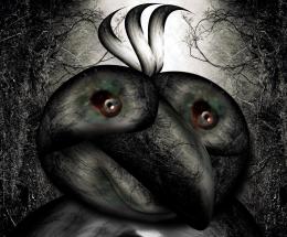 by Drivenslush 6757 views - final score: 51.2% |
Evasion 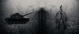 by xwd 3551 views - final score: 48.4% |
Howdie Guest!
You need to be logged in to rate this entry and participate in the contests!
LOGIN HERE or REGISTER FOR FREE
imho.....too colorful for background!
I so agree with genuine2009
According suggestions (thanks!) I paled some items, except flames and red flower, kept in vivid colors on purpose - it's a ritual of love...
looks better now....
Author I like what you are going for here....IMO the added elements are still too bright and require some blurring around the edges to help blend because in high res the things look to be "floating" above the ground..You might also want to try cloning some of the background to help with the blending issues..Best of Luck
Thanks! With suggestions and tips I can improve my work more and more!
Howdie stranger!
If you want to rate this picture or participate in this contest, just:
LOGIN HERE or REGISTER FOR FREE