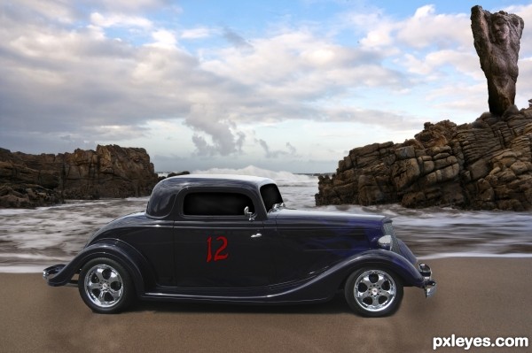
Found it a bit difficult to use 4 stock pics! :-) But thats the comp.... (5 years and 3405 days ago)
4 Sources:
Glamour  by CorneliaMladenova 8421 views - final score: 63.8% | Tazer 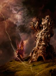 by arca 17069 views - final score: 62.8% | Lestat 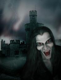 by jadedink 7659 views - final score: 60.7% |
Josh 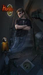 by Chalty669 5964 views - final score: 60.2% | Lost 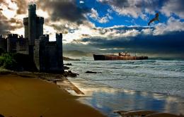 by Mario 5913 views - final score: 56.4% | The Sea Guardian 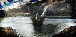 by Toothpick134 6822 views - final score: 55.9% |
Wearing Away... 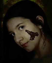 by Toothpick134 4859 views - final score: 55.5% | Mystery Island 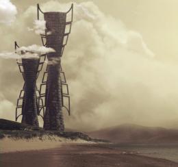 by sophia 8212 views - final score: 55.3% | I Dont Wanna be a Lost Picasso 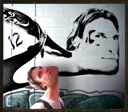 by Drivenslush 12004 views - final score: 55.1% |
Number 12 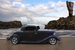 by layerstack 3677 views - final score: 54.8% | Cylinder 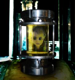 by migue1ito 3976 views - final score: 53.2% | Sin City Makeover 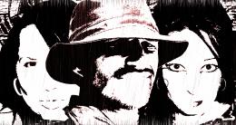 by layerstack 6868 views - final score: 52.7% |
Color Ride 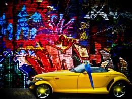 by Mario 4329 views - final score: 52.4% | Forbidden Kingdom 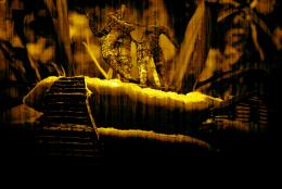 by taintedhockey 7870 views - final score: 51.9% | Roly Poly Dragonfly Heads 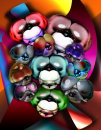 by Drivenslush 8470 views - final score: 51.4% |
On The Hunt 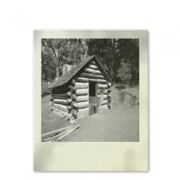 by baumillerkyle 7497 views - final score: 48.5% |
Howdie Guest!
You need to be logged in to rate this entry and participate in the contests!
LOGIN HERE or REGISTER FOR FREE
I think you can use more than one, author. When I came up with this idea, I just intended at least 4 pxl stock. But maybe you are having issues with your computer slowing when using that many layers.
 GL!
GL! 
Only nitpick would be to maybe made the 12 stand out a little more.
Thanks jawsh, your right, looks better. When i said i was having trouble using 4 stock pics, i meant finding stuff to fill my scene with, which would look right...i've looked through countless images...
Great comp idea..Thanks.
I uploaded more. Go browse
Oh I suggest resizing the"12" to a smaller size and remove the drop shadow. instead, duplicate the "12" layer, make it black and Use Gaussian Blur to about 4% and keep it under the original "12" layer. It will look more like a stenciled "12" sticker, as if it was put there by a body shop.
Ah! Ya see? Second layer with the gaussian blur looks much better now. GL author!
Howdie stranger!
If you want to rate this picture or participate in this contest, just:
LOGIN HERE or REGISTER FOR FREE