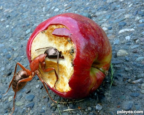
Took original photo, removed ant from back ground, put it into pic of rotten apple and resized, added shadow. (5 years and 3402 days ago)
1 Source:
- 1: source1
ducANTi  by solkee 23667 views - final score: 65% | Stingerlisks' Colony  by greymval 20228 views - final score: 58.6% | Nature vs Tech  by layerstack 22106 views - final score: 58.2% |
ANTzilla 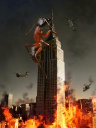 by Neese 25515 views - final score: 57% | Ant ARMY 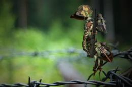 by MoNophian 16438 views - final score: 56.7% | Forbidden Fruit 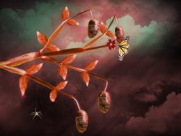 by locale 12043 views - final score: 56.1% |
Tango 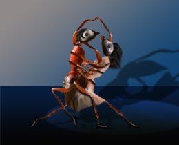 by George55 6381 views - final score: 56.1% | 49th sense 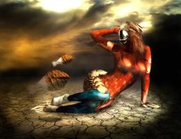 by itsdesign 6916 views - final score: 56.1% | Product of Inbreeding 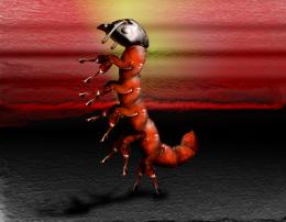 by Drivenslush 5824 views - final score: 56% |
winter 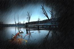 by sanjugs 5450 views - final score: 55.2% | Ant Ridge 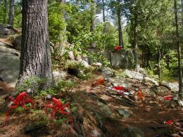 by Chuck 5624 views - final score: 53.7% | Hey!!! Get off my stuff... 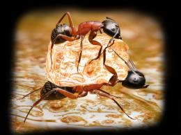 by locale 12452 views - final score: 53.7% |
Harvest time 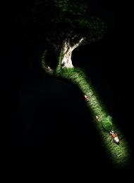 by itsdesign 5328 views - final score: 53.5% | Eye-Ant 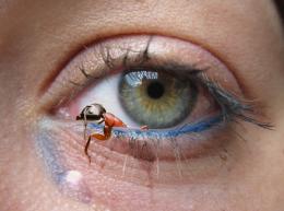 by omercb 22611 views - final score: 52.6% | Voltando pro lar 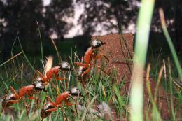 by Bikudo38 9442 views - final score: 52% |
Rotten 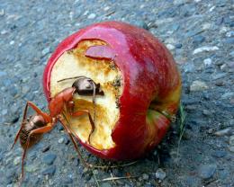 by jcfreak6363 9121 views - final score: 51.8% | Let's Rumble 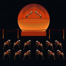 by Chuck 5227 views - final score: 51.3% | A True Bohemiant 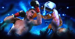 by tuckerhiggins 8537 views - final score: 50.4% |
ant porn 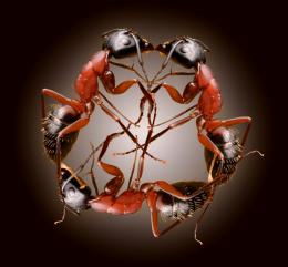 by eyelander 12685 views - final score: 49.2% | Thornstepper 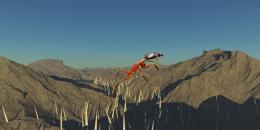 by locxoul 8255 views - final score: 48.2% |
Howdie Guest!
You need to be logged in to rate this entry and participate in the contests!
LOGIN HERE or REGISTER FOR FREE
It doesn't really have an OOB feeling about it.... Try tilting the frame backwards a bit by playing with the perspective. At the moment the ant just looks like its in front of the frame.

Another suggestion would be to have another background so he looks like he is going from one situation to another
Goodluck anyway.
EDIT: Oh wow a completely different image
That's a REALLY big ant!
u can also try adding shadow to the ant...it would make this looked more realistic.
u can also try adding shadow to the ant...it would make this looked more realistic.
Wouldn't want to come across that ant, it's huge. I would have picked a different color for the shadow instead of grey, possibly a darker part of the apple set to multiply.
Make the apple double the size and give ant shadow. Dark texture background vud suit. Nice idea. perspective to ant,, just give it a try..Carefully though.
Those were good suggestions author. Biggest thing it seems to lack though are the shadows.
Howdie stranger!
If you want to rate this picture or participate in this contest, just:
LOGIN HERE or REGISTER FOR FREE