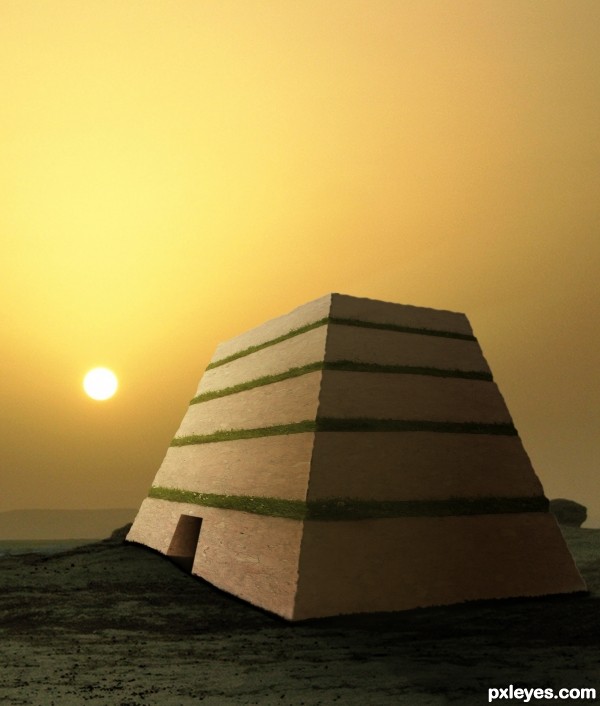
(5 years and 3384 days ago)
1 Source:
- 1: Landscape
The End  by ponti55 16648 views - final score: 61.2% | stepping stones  by igogolf 19278 views - final score: 58.2% | Confusion  by vimal 15998 views - final score: 57.3% |
from the Diary of Dreams  by dreamboy 28541 views - final score: 56.1% | The Path to Discovery 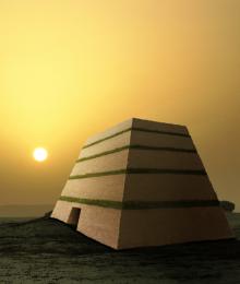 by GarethWaring 15539 views - final score: 55.6% | The road ends! 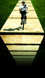 by shaiju1974 5774 views - final score: 55.6% |
Fencing in the Primary Colors  by Drivenslush 7121 views - final score: 53.6% | ... Grass and the Slabs  by hankphone 10624 views - final score: 52.3% | bridge 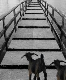 by ramesan 4583 views - final score: 49.4% |
Simple 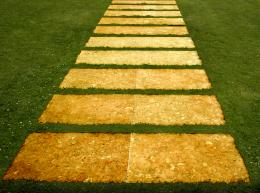 by jcfreak6363 4833 views - final score: 44.7% |
Howdie Guest!
You need to be logged in to rate this entry and participate in the contests!
LOGIN HERE or REGISTER FOR FREE
i dont get why the corner is so sharp between the shaded and lighted areas. but on the outsides its dull. other wise love the picture. very nice..!! and good idea too
I agree with taintedhockey about the sharpness... But nice work!
author,image is very nice but the difference in the sharpness is to obvious...i am sure that final score will be better if u fix that...best of luck
Why not just make a full pyramid?
Howdie stranger!
If you want to rate this picture or participate in this contest, just:
LOGIN HERE or REGISTER FOR FREE