(5 years and 3399 days ago)
The End  by ponti55 16719 views - final score: 61.2% | stepping stones  by igogolf 19327 views - final score: 58.2% | Confusion  by vimal 16055 views - final score: 57.3% |
from the Diary of Dreams  by dreamboy 28630 views - final score: 56.1% | The Path to Discovery  by GarethWaring 15590 views - final score: 55.6% | The road ends!  by shaiju1974 5801 views - final score: 55.6% |
Fencing in the Primary Colors  by Drivenslush 7158 views - final score: 53.6% | ... Grass and the Slabs  by hankphone 10678 views - final score: 52.3% | bridge  by ramesan 4597 views - final score: 49.4% |
Simple 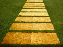 by jcfreak6363 4845 views - final score: 44.7% |
Howdie Guest!
You need to be logged in to rate this entry and participate in the contests!
LOGIN HERE or REGISTER FOR FREE
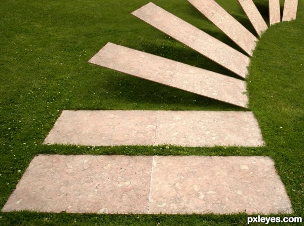
Great idea! Just 2 things: the stones should be thicker, and instead of faking it, you could have imported the grass edge from the foreground stone to the edges of the others.
(You still can...). GL author.
haha love the idea!
Moving stones!!! nice work Add thickness will be much better.
AWESOME IDEA (to thicken the stones easily.. just duplicate it and lower the back layer with nudge.. repeat and it will be plenty think in no time... other then that.. EXCELLENT WORK
Love it!
That's the definition of "simple & effective - less is more"
You could follow Driven's advice, pay attention to perspective though, the further the stone the thiner it is.
Also fix that grass like CMYK said and clear those masking problems.
GL.
Fantastic work author...love the idea and the execution...very well done man
Excellent work GL
Congrats for your third place, Vimal!
Very clever - congrats on third place!
thank you....
congrats, creative!
Howdie stranger!
If you want to rate this picture or participate in this contest, just:
LOGIN HERE or REGISTER FOR FREE