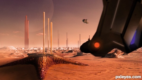
Back from another succesfull mission....
(5 years and 3370 days ago)
3 Sources:
- 1: background
- 2: texture for spacecraft
- 3: moon

Back from another succesfull mission....
(5 years and 3370 days ago)
Eternity  by CorneliaMladenova 12193 views - final score: 59.8% | Star Sector 5  by layerstack 12791 views - final score: 58.1% | On The Ocean Floor  by TwilightMuse 47162 views - final score: 57.4% |
Jelly Cab of the Stars 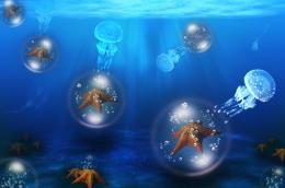 by Floortje1973 29078 views - final score: 57.3% | The Swarm 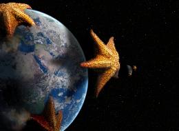 by lchappell 12098 views - final score: 56.8% | Sea Star Hut 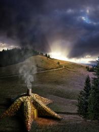 by ShiZa 12095 views - final score: 56.5% |
Mean People Suck 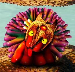 by Drivenslush 9964 views - final score: 55.4% | Dino mock up 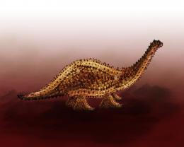 by megryanchapelle 8532 views - final score: 54.8% | The Knight and the Dragon 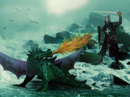 by artgirl1935 6371 views - final score: 54.6% |
Star homes 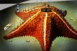 by sanjugs 4702 views - final score: 53.2% | Star Light! 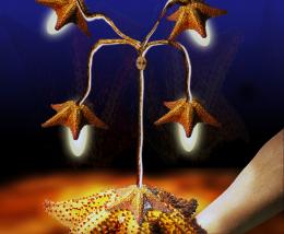 by shaiju1974 5574 views - final score: 52.8% | Have you eaten the starfish? 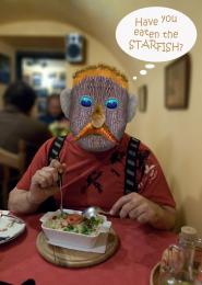 by Augustinaart 9450 views - final score: 52.6% |
invasion 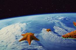 by igogolf 4492 views - final score: 52.3% | Beautiful Shoes 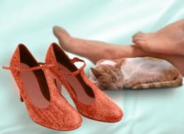 by locale 9289 views - final score: 51.8% | Fashion with star 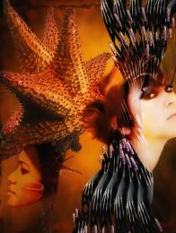 by bingbong088 5653 views - final score: 51.5% |
First Star to the Right 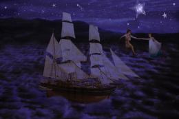 by TwilightMuse 15192 views - final score: 50.8% | A Star is born 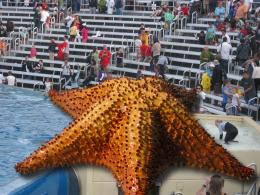 by sgc 5883 views - final score: 49% |
Howdie Guest!
You need to be logged in to rate this entry and participate in the contests!
LOGIN HERE or REGISTER FOR FREE
This is a cool concept, and it's nice to see a mix of 3d & 2d.
Great idea and very nice work author...I have to ask why the 3d elements are so blurry? U made them in 3d and they have to be sharper for sure...IMHO u should fix that...best of luck
erathion, thanks for your comment i used a motion blur filter on the spacecraft to try and convey movement/speed. Also the spacecraft is not supposed to be the main focus, i wanted/needed the starfish to be the point of interest as that is what i had to photoshop and the craft is used to bulk out the scene. Hope this makes scense, i can make it sharp, but feel this would detract from overall image.
  Thank you erathion, i do appreciate you taking the time to comment.
An interesting image with a lot of imagination, but i don't really agree with your choice of how you transformed the starfish itself. The source lost a lot of depth, and in high res it looks over-warped. I'd suggest either shading the starfish with the dodge and burn tools to give it a bit more depth, or simply adding the source again, but this time without the flattening.
ponti55 i needed it to match the desert scene. I didn't want to go mad with the transform but if i hadn't someone would have commented that it didn't blend with the background enough......and you have commented on the opposite thanks for your input..
Well then i might suggest simply changing the background. In my opinion it would improve the image dramatically if the source didn't look so 2-dimensional.
Congratulations!
Congrats...
Congrats for 2nd
Howdie stranger!
If you want to rate this picture or participate in this contest, just:
LOGIN HERE or REGISTER FOR FREE