Best viewed in Full Screen mode. (F11) (5 years and 3395 days ago)
1 Source:
Eternity  by CorneliaMladenova 12228 views - final score: 59.8% | Star Sector 5  by layerstack 12824 views - final score: 58.1% | On The Ocean Floor  by TwilightMuse 47309 views - final score: 57.4% |
Jelly Cab of the Stars 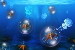 by Floortje1973 29207 views - final score: 57.3% | The Swarm 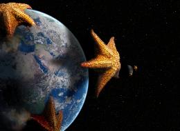 by lchappell 12135 views - final score: 56.8% | Sea Star Hut 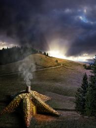 by ShiZa 12151 views - final score: 56.5% |
Mean People Suck 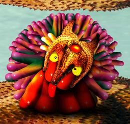 by Drivenslush 10021 views - final score: 55.4% | Dino mock up  by megryanchapelle 8575 views - final score: 54.8% | The Knight and the Dragon  by artgirl1935 6405 views - final score: 54.6% |
Star homes  by sanjugs 4731 views - final score: 53.2% | Star Light!  by shaiju1974 5605 views - final score: 52.8% | Have you eaten the starfish? 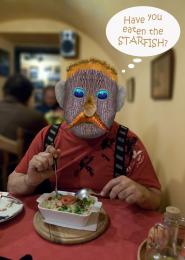 by Augustinaart 9537 views - final score: 52.6% |
invasion 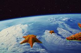 by igogolf 4516 views - final score: 52.3% | Beautiful Shoes  by locale 9328 views - final score: 51.8% | Fashion with star 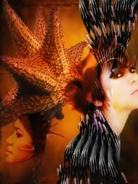 by bingbong088 5699 views - final score: 51.5% |
First Star to the Right 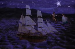 by TwilightMuse 15330 views - final score: 50.8% | A Star is born 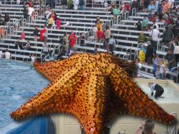 by sgc 5915 views - final score: 49% |
Howdie Guest!
You need to be logged in to rate this entry and participate in the contests!
LOGIN HERE or REGISTER FOR FREE
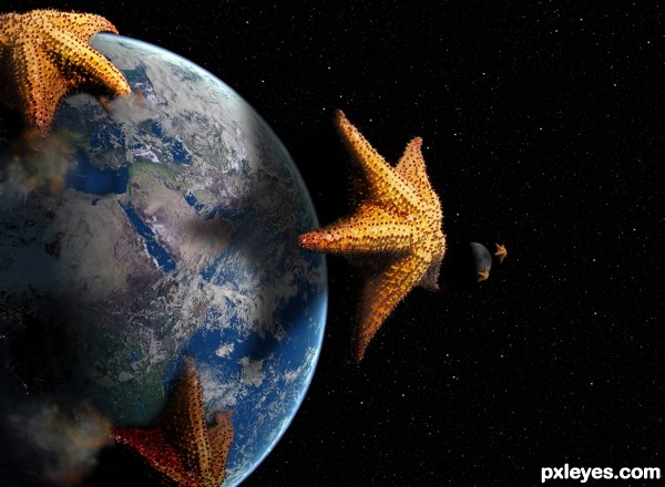
Cool concept. The 3 o'clock earth starfish is maybe a bit too close; a little more distance might be more dramatic/threatening/tell more of a story. The outer edges of the 12 o'clock starfish's arms seem weak because (as revealed in hi-res) the water line bulges instead of remaining flat to the earth's surface.
The moon is hard to discern plus the closer starfish isn't casting any shadow. I think just deleting that closer starfish would be a simplifying improvement.
Nice1..Faved!
nice idea!
A good idea, despite a similar image already being in the contest. I agree with Dan about the uppermost starfish being above the waterline even though it has been clearly warped. Other than that it looks good Good attention to lights and shadows too.
For the comments about the upper starfish, it is as I want it to be. Yes it has been warped. I am trying to portray the creature as if it is wrapping its upper most arm UP and over the atmosphere and curvature of the Earth. If you notice the other arms are digging into the surface. Ponti and Dan I am not sure what you 2 are getting at. As for having been done as a similar idea...well I started this project as you see it with out seeing the other similar entry. It is not the first time things like this have happened here and probably will not be the last. Thank you for the comments and the favorite.
This is a pretty cool concept, name and execution, author. Quite the mutated starfish, very scifi!

That one center leg on the bottom starfish looks as if it's really burrowing below the water surface - great work! Dust and fire on the others works, too. Planet looks like a NASA image, nice job on that as well.
This swarm looks unbeatable
Very cool work author...gl
Wauw amazing :O
should've been third at least ..
Howdie stranger!
If you want to rate this picture or participate in this contest, just:
LOGIN HERE or REGISTER FOR FREE