Thanks to:
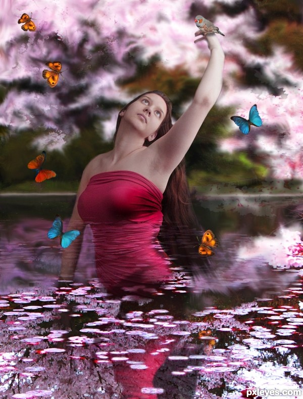
mqtrf, for the pics of the bird and butterfly.
Clinge, for the pic of the blue butterfly.
MaddieMeyer, for the pic of the beautiful girl in red.
The rest is PS and brain work. (5 years and 3360 days ago)
4 Sources:
Sakura  by jaskier 12720 views - final score: 60.2% | Window to Spring  by artgirl1935 12655 views - final score: 60% | Little mermaid  by marina08 14758 views - final score: 58.4% |
the pond 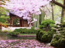 by dekwid 9985 views - final score: 58.4% | Spring Garden 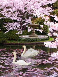 by George55 42910 views - final score: 55.3% | lighting queen  by itsdesign 6461 views - final score: 54.4% |
Second Foundation 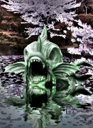 by Drivenslush 5955 views - final score: 53.7% | SPRING 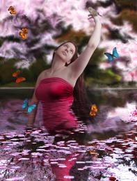 by George55 4755 views - final score: 52.5% | Dream darktaci 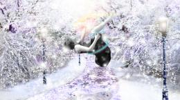 by itsdesign 6125 views - final score: 51.9% |
Howdie Guest!
You need to be logged in to rate this entry and participate in the contests!
LOGIN HERE or REGISTER FOR FREE
Where's the horizon line?
CMYK: There is no horizon line in this image. It is just a background, with some texture all around.
Sorry, I should have said waterline.
Do not be sorry Bob: I got wild smudging around, and lost it.... but put it back.....
I think the butterflies and girl need to be better blended and adjusted to look as if they actually belong in this environment. Although you've used a reflection, it's not all gelling together very well. Maybe try playing around with the hue-sat levels of the girl and add some filters and highlights to her to make her look like she belongs in this pink, dreamy universe.
lots of fun put into this.. good luck author
I would remove the white edges around the orange butterfly and adjust the shadow underneath the bird (maybe try a different blend mode?) I'm not too sure about the transparency of the model, but i think it;s a really nice idea, and your smudged background in the sbs looks great
Thanks for suggestions, made some little adjustments to the original image.
this is very nice idea,colors are matched very well...i am not sure is that what u want but there is a lot masking problems...on girl stomach,right arm and on background...if u want that effect then i understand but IMHO would be better if u clean this author...Sorry for nit picks...
erathion: I did not want to take away some of the source image from the image of the girl. That masking was intentional. I wanted this image to look as it is. If I clean the masking over the girl's body, it would look as if she was floating in the air. I just wanted some blending of the source image over the girl.... thanks for suggestions any way.
Very pretty!
Howdie stranger!
If you want to rate this picture or participate in this contest, just:
LOGIN HERE or REGISTER FOR FREE