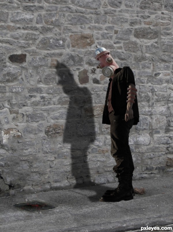
(5 years and 3374 days ago)
Punisher  by Chalty669 11185 views - final score: 63% | The Ultimate Executioner  by Siddhartha 15347 views - final score: 60.9% | Lovely  by lahiripartha 10108 views - final score: 57.8% |
Deep Blue Trouble  by Stowsk 10603 views - final score: 56.5% | Next Gen  by locxoul 10863 views - final score: 56.4% | Recreating Love  by ponti55 7027 views - final score: 55.7% |
Robo  by lahiripartha 4762 views - final score: 55.2% | Hydranthead 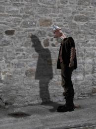 by Gunstram 10200 views - final score: 54.8% | Hydrant mask 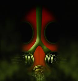 by itsdesign 7872 views - final score: 54.2% |
Taj Mahal  by ReDZN 13134 views - final score: 52.9% | New Guy in Town!!  by locale 11340 views - final score: 52.4% | waterfall 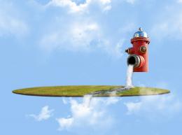 by jericho 7538 views - final score: 51.9% |
Fish Tank 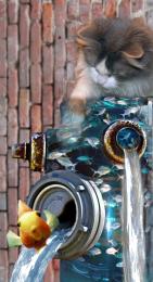 by JamesP 7238 views - final score: 51.9% | Opening Night at the Gallery 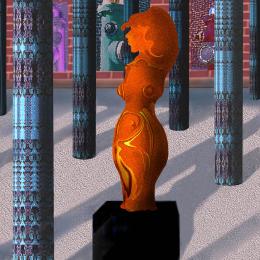 by artgirl1935 6826 views - final score: 50.9% | Homage to Peter Max  by artgirl1935 9498 views - final score: 50.2% |
Magic coOlOor fire Hydrant 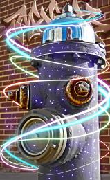 by sba3i06 4280 views - final score: 49.9% | THE POST BOX 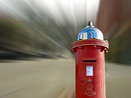 by GPLINGESH 7488 views - final score: 49.7% | Light House 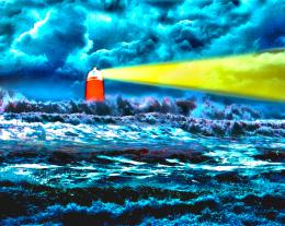 by locale 17320 views - final score: 46.6% |
Highrise hell 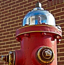 by sgc 6566 views - final score: 45.5% |
Howdie Guest!
You need to be logged in to rate this entry and participate in the contests!
LOGIN HERE or REGISTER FOR FREE
Not sure if source 1 is usable. Light on head is opposite light on the arm. Good idea, though.
Source one is me!
Author, just post your own pic uncut in a step-by-step guide as per the PXL guidelines and you'll be OK.
LOL If I was called "son" and (not to mention if I was a guy) the guy or gal wasn't my father I would be a little irritated...
Author, I like this picture. I agree about the lighting of the arm vs head though but either way it looks like a lot of hard work to get this so great job!
Thank you! Yeah, I knew the lighting was off, but I need to learn to do lighting correctly. The two images didn't "match" light wise. Some day I'll get it!
I've been called worse on PXL, I guess people translate appelatives from their own language presuming they'll work in english too.
For the light thing, try cloning the shadowed paint into the light area and then add another layer - lower oppacity or set on soft light and paint with white using a soft brush.
Ah, I see what you're saying, thanks.
Author, you'll save yourself a lot of work if you match your light sources before you edit the items. It helps A LOT.
Nice PiC
Thanks Ping, it's something I'll have to learn.
Very interesting work author...love the idea and u shoved nice blend skills...Use same clone stamp or paint brush to fix different light sources issue...With resolution like this that is very possible...also i would suggest u to create slight shadow under his boots...any how this is very nice entry and i wish u best of luck
It would be funny if he was peeing on the wall!
Howdie stranger!
If you want to rate this picture or participate in this contest, just:
LOGIN HERE or REGISTER FOR FREE