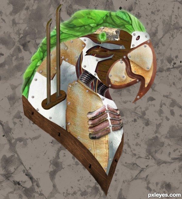
ran out of time. didn't know what to put as the background. (5 years and 3372 days ago)
Chasing  by langstrum 8606 views - final score: 61.1% | Snow Day 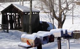 by pingenvy 13864 views - final score: 60.8% | home  by dekwid 10215 views - final score: 59.9% |
The love letter  by marina08 11891 views - final score: 59.5% | Gnome Haven 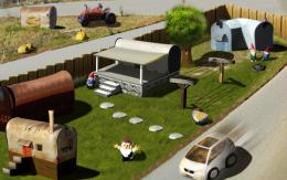 by migue1ito 11286 views - final score: 58.1% | Remains Of The Past 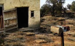 by George55 7357 views - final score: 55.8% |
steampunk parrot 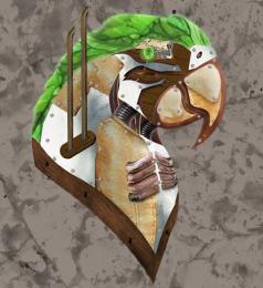 by jaescoe21 7568 views - final score: 53.6% | Exit Stage Left  by Drivenslush 6790 views - final score: 53.3% | Mailbox of life  by marina08 5707 views - final score: 53.3% |
Howdie Guest!
You need to be logged in to rate this entry and participate in the contests!
LOGIN HERE or REGISTER FOR FREE
Interesting, but flat.
yes, i know i wish i would have added a little bit more shadowing and stuff. It didn't turn out the way I wanted it.
If you don't know what ot put in background, best thing to do is blur it. As CMYK46 suggested, shadows needed.
Shadows and shading would have made this better, sure...but...what an interesting take on the source! I was waiting for some steampunk styling to come out of those rusty mailboxes!
Howdie stranger!
If you want to rate this picture or participate in this contest, just:
LOGIN HERE or REGISTER FOR FREE