(5 years and 3354 days ago)
Patience  by ponti55 14057 views - final score: 58.4% | Secheresse  by lolu 12299 views - final score: 56.7% | A Deserted Nesting Place  by artgirl1935 18305 views - final score: 56.7% |
Home of earth  by Haganino 12116 views - final score: 56.1% | Truth Fears No Questions 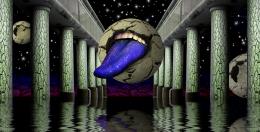 by Drivenslush 12818 views - final score: 56% | Its Elemental  by jadedink 8507 views - final score: 55.2% |
frost 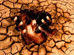 by HELSIEN 6979 views - final score: 54.2% | Inner Death 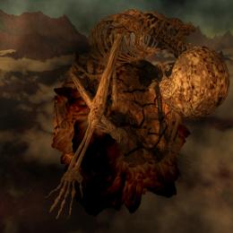 by locxoul 6646 views - final score: 53.9% | Last flowers 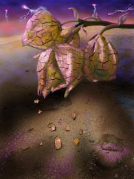 by marina08 6053 views - final score: 53.7% |
Grungy 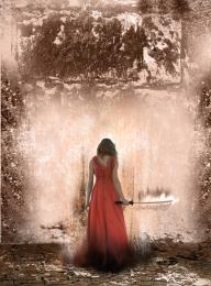 by ReDZN 4660 views - final score: 53.6% | Jelly Awaiting its Turn WEEEEE 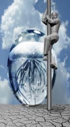 by Drivenslush 11713 views - final score: 53.2% | Cathedral 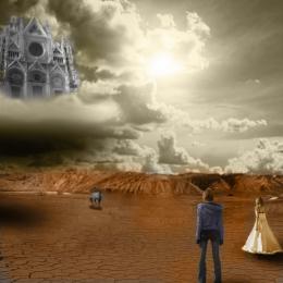 by ReDZN 6575 views - final score: 52.6% |
Dancing By Moonlight 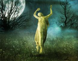 by Lamantine 7196 views - final score: 52.3% | Territorial Greed 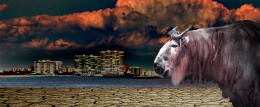 by Drivenslush 6241 views - final score: 51.2% | Hope 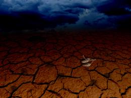 by locale 4377 views - final score: 50.4% |
Ancient Ways 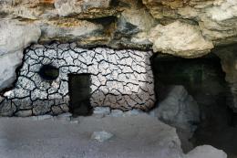 by sgc 7514 views - final score: 49.8% | How much does water weigh? 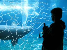 by sgc 10106 views - final score: 49.6% | Angel or Demon 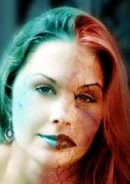 by kushpatel 8418 views - final score: 49.5% |
Stream 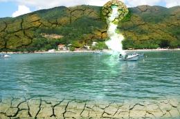 by shaiju1974 5458 views - final score: 48.7% | dry eye 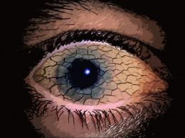 by farsite 11930 views - final score: 48.3% | Its a strike 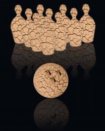 by Chuck 6442 views - final score: 46.2% |
Howdie Guest!
You need to be logged in to rate this entry and participate in the contests!
LOGIN HERE or REGISTER FOR FREE
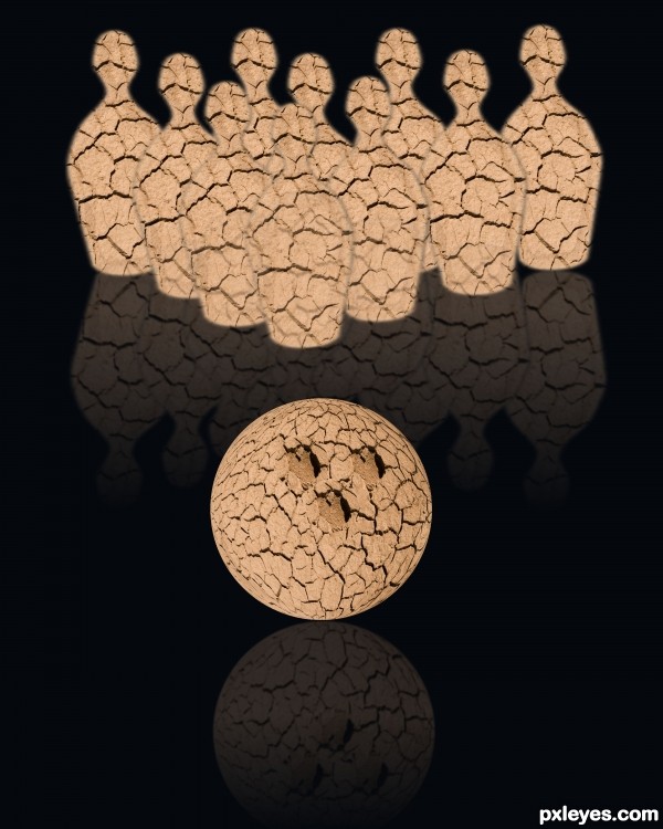
hehehe.. cute idea author.. IMHO.. if you take a soft large brush and use the BURN TOOL, gently shade each side of the pins and ball.. it will give them a bit more depth and enhance the image.. love the fact you used the natural hole in the source to represent the finger holes.. good luck
Very nice idea author but demands a bit more work...Use big soft brush especially on the ball to create more realistic look and some 3D effect...select ball and on a new layer go around of the selection with big soft black brush...also with some white u could create some highlights...IMHO u should do the same on the pins too and create some space between them...sorry for the nagging...
Hey Thanks Drivenslush and erathion I did a redo hows it look now?
Author, the guys ment to paint the shadows & highlights on your objects. Make a new layer o ntop of your object, make it a clipping mask set a lower oppacity, and paint with a soft brush using black & white so that it looks 3d, like this pin and this ball. Make sure the light on all objects comes from the same direction.
http://www.elite-view.com/art/Sports_Athletics/Bowling/564222~Bowling-Pin-Posters.jpg
http://2.bp.blogspot.com/_iDA6dwYSASo/TScwKGvIAeI/AAAAAAAABC8/mjzSWcEk2hs/s1600/2.%2Bsphere.jpg
Also reflection of the right side pin is a bit wrong, but easy to fix.
Howdie stranger!
If you want to rate this picture or participate in this contest, just:
LOGIN HERE or REGISTER FOR FREE