
Source image used to create two towers. (5 years and 3371 days ago)
3 Sources:
Big Bug 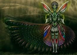 by CorneliaMladenova 7815 views - final score: 62.2% | Glasshopper 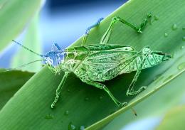 by derdevil 13875 views - final score: 59.5% | robohopper 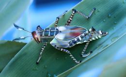 by Se7eN0f9 6737 views - final score: 59% |
Whoosh! 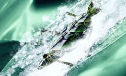 by itsdesign 6111 views - final score: 55% | Cobra moth 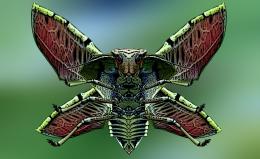 by ibmaxed 11385 views - final score: 54.5% | Shave and a Haircut Two Bits 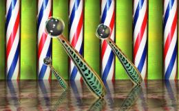 by Drivenslush 9214 views - final score: 53.5% |
Nurse Farina & Her Evil Twin 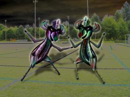 by Drivenslush 9172 views - final score: 51.7% | Grasshopper Twin Towers 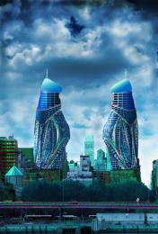 by locale 7462 views - final score: 51.7% | ThunderGiraffes are GOOOOOOOO! 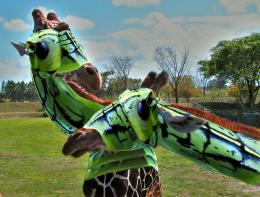 by Drivenslush 5364 views - final score: 51.5% |
grass hopper 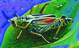 by igogolf 5124 views - final score: 50% |
Howdie Guest!
You need to be logged in to rate this entry and participate in the contests!
LOGIN HERE or REGISTER FOR FREE
this is a pretty neat idea author.. way out of the box.... you may want to try and get rid of that orangy red stroke line around the top... it defeats the realism a bit (IMHO).. you may also want to reverse the burn dodge on one of the towers so that the shading matches the angle of light (it's not really that important, but I've noticed if you don't correct the lighting on a subject many members have a snit)

Good luck.. and great idea..
Thanks Drivenslush. Think, I should get rid of the orange outline. Will work on it. Your advice is to the point. Thanks again.
Yeah, I appreciate your view about lighting. It took 15 hours work to reach here. Maybe, my eyes got color saturated.
very interesting concept...construction is well made and as Ernest sad i will to remove orange stroke...best of luck
Excellent tenacity .. wish you major luck
Thanks Drivenslush !!
As Drivenslush has already pointed out, the lighting on half of your image is wrong. When considering making a realistic style image such as this, lighting is important. Check out this valuable tutorial: http://www.psdbox.com/tutorials/manipulation-secrets-3-shading-and-lighting/
Thanks CMYK46. Link is truly eyeopener.
Not sure if it's intentional or not, but you have a brown outline at the top of each building. If you remove those and soften the edge a bit it would help. Nice image and great imagination too.
Thanks pixelkid for the suggestion.
Cool idea, somehow reminds me of the architecture in Dubai.
Corrected the picture aided by suggested expert comment from Drivenslush about red line. Hatss offf.

CMYK46, I like your critically hurting yet actual comments. I tried to correct the lightings. Hope you think it is ok now.
pixelkid, the red line came through copy layer styles, think now, it wasn't appropriate, so removed it.
Thanks erathion, sweetest and in my opinion, a very creative person in my pxleyes world.
Thanks pearlie, you always shows way to do the better way in a very honest and unhurtingly factual way, you did to me and I also read many of your comments to other pictures
Howdie stranger!
If you want to rate this picture or participate in this contest, just:
LOGIN HERE or REGISTER FOR FREE