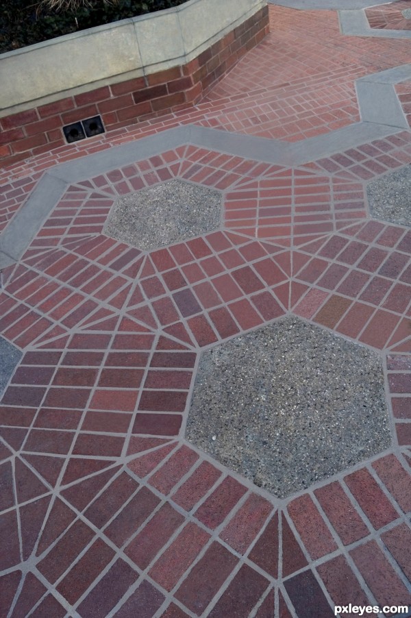
Almost good as new! (5 years and 3367 days ago)
Far Away  by CorneliaMladenova 17216 views - final score: 62.4% | The Protector (updated)  by hereisanoop 20541 views - final score: 61.3% | scouts  by buzzy 18691 views - final score: 60.1% |
the promised land  by dekwid 16839 views - final score: 59.9% | survivors  by hereisanoop 16214 views - final score: 59.7% | Dragon Armor  by Stowsk 8205 views - final score: 59.2% |
Echoes  by pingenvy 3801 views - final score: 58.3% | Renovated Walkway  by MossyB 5165 views - final score: 55.7% | Barricade???? What barricade? 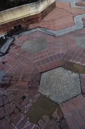 by jawshoewhah 5033 views - final score: 55.1% |
...and Everything the Dappled  by Drivenslush 5354 views - final score: 54.8% | An alien has come on earth..  by nishagandhi 7820 views - final score: 51.9% |
Howdie Guest!
You need to be logged in to rate this entry and participate in the contests!
LOGIN HERE or REGISTER FOR FREE
Excellent work here, I'm sure it took you quite some time = )
Not exactly original......
Perhaps, but it's not a CBR, and it shows a bit more effort...
CBR?
CBR = "Chopped Beyond Recognition"
When you can't make out the original image at all.
oooo I gotcha! Been wondering what to call them. lol ty!
Author this is very nice clean work without any doubt but its true that is not very original....Its not problem in CBR or anything similar...thing is that one other author did the same thing few days ago...so in that case your entry was a copy...i know that is not and that u put effort in this but its not original...maybe u did not watch other entry's in the contest...who knows...any how i wish u best of luck
I think the author did a bit more than the other. Both are great and i think that it took a lot of work to get rid of the moss etc. Nice work!
I think it is original because the author took the extra steps to get rid of the moss etc.
Good luck to all and have fun!
Renovating the image is MUCH more than simply copying getting rid of the sign...But everyone is entitled to their own opinion.

Unlike simple "cut and paste," I drew out the mortar lines, which, if you take the time to look, you will see are MUCH more accurate than the other, simpler version...
As opposed to just removing the sign, I "renovated" the walk. Not a copy at all...But definitely an improvement.
IMO, you should have taken the time to add defocus to areas because right now it all looks too clear. You cloned the bricks from up from and restored the background in the same clarity, Making the DOF look off.
And least in the first version, they got the DOF right.
This is a good clean job. Would you please come and do my driveway?
Howdie stranger!
If you want to rate this picture or participate in this contest, just:
LOGIN HERE or REGISTER FOR FREE