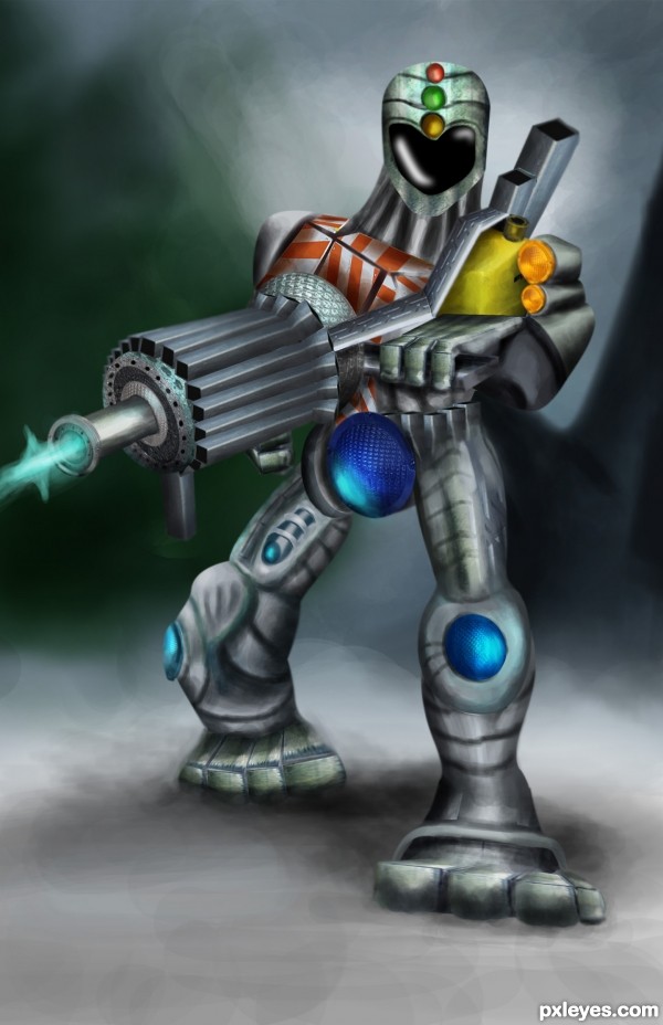
source and ps only... (5 years and 3362 days ago)
Far Away  by CorneliaMladenova 17209 views - final score: 62.4% | The Protector (updated)  by hereisanoop 20535 views - final score: 61.3% | scouts  by buzzy 18682 views - final score: 60.1% |
the promised land  by dekwid 16835 views - final score: 59.9% | survivors 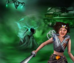 by hereisanoop 16208 views - final score: 59.7% | Dragon Armor 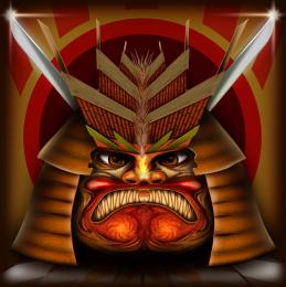 by Stowsk 8201 views - final score: 59.2% |
Echoes  by pingenvy 3795 views - final score: 58.3% | Renovated Walkway 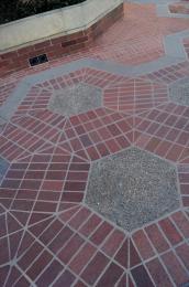 by MossyB 5160 views - final score: 55.7% | Barricade???? What barricade? 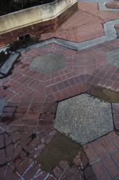 by jawshoewhah 5026 views - final score: 55.1% |
...and Everything the Dappled  by Drivenslush 5349 views - final score: 54.8% | An alien has come on earth..  by nishagandhi 7810 views - final score: 51.9% |
Howdie Guest!
You need to be logged in to rate this entry and participate in the contests!
LOGIN HERE or REGISTER FOR FREE
Imaginative, but pretty lopsided as well.
There are some issues with perspective here, but I like the chop, and a good inage overall.
excellent construction
great one
I really love this idea and it could turn out great. But I agree with RayTedwell about the perspective, but that might just be an "easy" solve. Take the left "hip" light, although the leg is behind the right one, the light is bigger. You might want to change that and maybe you solved the biggest issue in perspective. I would also work on the right hand, now it seems attached to the body, try and soften the edge. You've put a lot of detail in the body, give the head some more detail, now it looks unfinished in comparison to the rest of the body. I hope you find the time to change these things, and let me know it my suggestions worked out, so I can learn as well I wish you the best of luck author, great job!
Nice idea and cool execution author! Floortje1973 gave some sound advice...but quite simply put...both feet are straight forward, but the Protector's right knee is facing away. This is what is making it look awkward to me. Great job using the source, though.
I like your changes author! It is so much better now, I see you did quit some changes, hand gone and just one light on the hips. Great job! @pixelkid has a point about the knee, but that does not bother me so much because the foot is twisted and not flat on the floor. There is a sense of movement in there. The head is better now, now it looks finished. I think it's fantastic you take comments and start working with the advice right away. Props for you author!
Agrees with people about the edit changes. It honestly just seems like it meeds some final details attended to. Some last minute smoothing and blending. Still a unique entry and I can still see the source without going to your SBS, so GL!
Nicely constructed.........G/L Author.
Amazing work author...Your work on a ground is perfect...whole construction is great but his legs are master piece...well done
Hey my friend, a second place is not bad at all. You mastered your entry. The effort you put into it, is reflected in the voting and the results of this contest. Congratulations Anoop!
Congrats for 2nd
Congratulatons, Anoop!
Congrats!!
congratulations...
congrats.
congrats Anoop
Congrats anoop! i thought it was a great use of source!
congrats on 2nd!!
congrats for introducing another character....
Howdie stranger!
If you want to rate this picture or participate in this contest, just:
LOGIN HERE or REGISTER FOR FREE