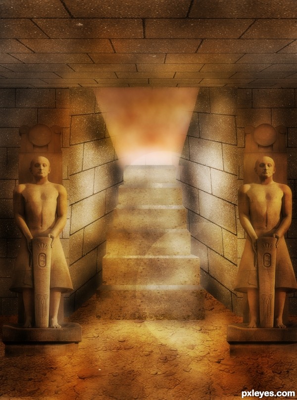
(5 years and 3368 days ago)
6 Sources:
- 1: Tutorial By Patrick Lopez
- 2: Wall
- 3: Floor
- 4: Statue
- 5: Sunset
- 6: Stairs Texture

(5 years and 3368 days ago)
Photo Manga  by MossyB 19054 views - final score: 60.8% | Vector-Style Woman Composition  by CorneliaMladenova 21255 views - final score: 59% | My Little Green Apple  by EmiK 46246 views - final score: 58.7% |
PopArt  by Floortje1973 25414 views - final score: 57.8% | TuT  by RIPSAW 11763 views - final score: 57.8% | tea time  by steed 9990 views - final score: 57.3% |
The Greenhouse Effect  by blueorchid2011 15344 views - final score: 57% | Pie chart photo manipulation  by ibmaxed 14825 views - final score: 56.7% | 3D Glass Icon by CorneliaMladenova 8846 views - final score: 56.1% |
Exploding Moon  by lchappell 8595 views - final score: 55.5% | Mysterious night...  by nishagandhi 6854 views - final score: 54.9% | Little Pink Flowers  by lchappell 6752 views - final score: 54.8% |
FIRST!!!!  by Dragoncide 7800 views - final score: 54.4% | Interweaving Photo Strips 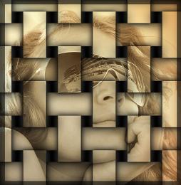 by DYNOSSAURUS 16557 views - final score: 54.2% | Sketch ME 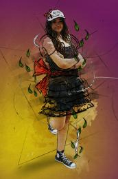 by duma8821 6809 views - final score: 54% |
Sarchophagus. 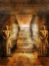 by Lamantine 5102 views - final score: 54% | Just out from the tricky holes  by Augustinaart 10494 views - final score: 53.6% | Heart Bokeh  by swan10 13997 views - final score: 53.6% |
water boy  by kathyw 7881 views - final score: 53.3% | Old Man  by vwluvrs 10726 views - final score: 49.2% |
Howdie Guest!
You need to be logged in to rate this entry and participate in the contests!
LOGIN HERE or REGISTER FOR FREE
The bricks need to be aligned at the corners & the figure on our right should be flipped to match the light source. If you want to follow a tut, at least try to get the basics right.
Sorry but the walls and steps do not look right, a shame because i like the idea, maybe you could try to correct it
Well it's not entirely your fault, cause the author of the tutorial had some problems with the perspective. That entrace should follow the horizontal lines between the bricks, instead the entire opening in the original is ambiguous, in reality it would make no sense.
However you should be more carefull at step 6, the second part, where it said that the gaps should match., and the stairs should be from wall to wall.
If you have probs. with proportions, use the final result of the tut., and draw some guide lines over it. Use them to build your entry on top.
Thanks greymval Yeah i was having some difficulties with that, I think I will be drawing them instead. Will edit asap, thanks again !
Nice attempt at a difficult tutorial. I can see you put some effort into this and it is a learning process ... that is what tutorials are for, right? I think greymval's suggestion are valid and helpful.
Top work author...well done
Howdie stranger!
If you want to rate this picture or participate in this contest, just:
LOGIN HERE or REGISTER FOR FREE