
Just a pop art kind of thing. (5 years and 3357 days ago)
Kzinti Warrior 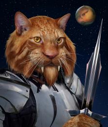 by spaceranger 14836 views - final score: 64.4% | Take Me Home 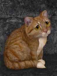 by IDt8r 11022 views - final score: 61.2% | Kittle 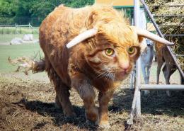 by RickLaMesa 11381 views - final score: 58.9% |
Orangacat  by freejay 9051 views - final score: 58.4% | Princess Kearah  by Akassa 9646 views - final score: 57.4% | In the Sways and Bends 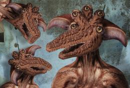 by Drivenslush 5805 views - final score: 56.7% |
lost cat 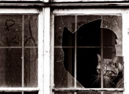 by kathyw 6428 views - final score: 56.7% | Skeleton Wings  by elliejane 9253 views - final score: 55.2% | TO ARMS 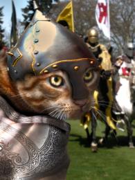 by HELSIEN 6364 views - final score: 53.4% |
What a hoot 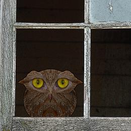 by ibmaxed 6806 views - final score: 52.5% | Rats hunting for Cat 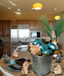 by suni271980 17674 views - final score: 51.8% | Catwoman 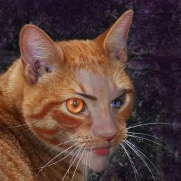 by locale 5583 views - final score: 51.7% |
Night Creature  by TwilightMuse 5468 views - final score: 51.1% | Meow  by kushpatel 6841 views - final score: 50.2% | simple enhancement  by CrystleClear 6860 views - final score: 50.1% |
General Meow 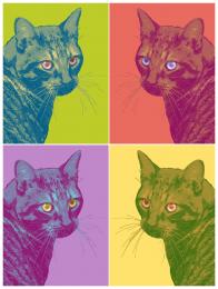 by alikat 15074 views - final score: 49.6% | Cat and window 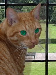 by envie 6867 views - final score: 47.4% | Soft Portrait 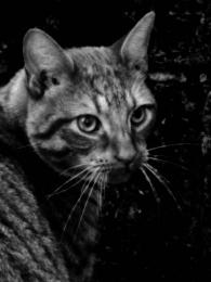 by sanjugs 5962 views - final score: 47% |
Cat 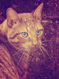 by alikat 8835 views - final score: 46.9% |
Howdie Guest!
You need to be logged in to rate this entry and participate in the contests!
LOGIN HERE or REGISTER FOR FREE
I think that Photoshop requires a little more imagination, a little more creativity, no point to set anything !

let this be a guide :
cut - layer it - transform - insert - create - adjust - and prepare for critics
And welcome to the photoshop contest site
GL
I like the "Warhol Pop Art" effect. Nicely done! Sometimes, simpler is better.
I think there is creativity in treating the eyes differently and in making the great color choices, not to mention the overall concept. However, having all the images facing the same way would be more Warholian and compelling IMO. (BTW is the title an allusion to Warhol's 'Mao'?)
Love it ... I have to agree with Mossy and Dan ... nice replication of AW's work. Love what you have done with the eyes as well.
very Andy Warhol.. and very well done (this would look great on a side of a building.. or a floating center piece in a restaurant less is often more....good luck
Howdie stranger!
If you want to rate this picture or participate in this contest, just:
LOGIN HERE or REGISTER FOR FREE