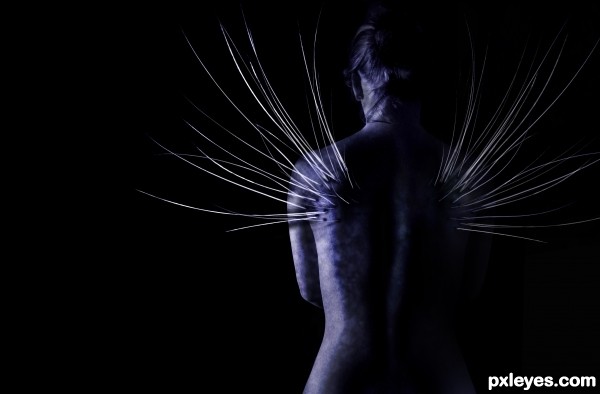
Not as much 'cat' as the other entries, but I thought, 'Oh, well, why not?' lol
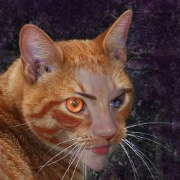
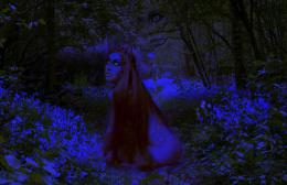
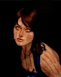
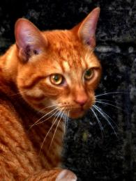
Base photo of woman's back, cat's whiskers duplicated several times, cropped, edited and flipped, then overlayed with a 'hard light' filter. Various tweaking of 'hue and saturation' plus using some of the brickwork to add texture to the woman's back.
Edited to say: have tweaked image based on comment about the overall darkness - have lightened image a bit, then copied and flipped the left hand side of the woman and blended it into the right, to give more of an idea of the form. The original final image is still in the sbs if you want to compare and contrast. (5 years and 3363 days ago)
- 1: Woman

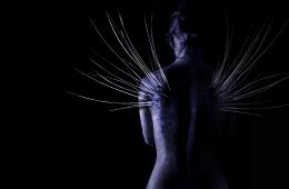


Too dark overall - I thought it was a flower of some sort until you explained it was a woman's back...It's so dark, you can't see where the "wing" on the RH side is attached, or if it even IS attached to anything.
Great, imaginative concept, just too hard to see what it is.
Thank you for the comment, and good point about the darkness. I have gone back and tweaked accordingly - do you think that has made a positive difference?
It's more discernable as a woman, but the LH edge could still use a little more emphasis of contour, perhaps just a bit lighter along the shoulder, since the back is in darkness?
She should also have some light along the edge of her neck on the LH side along with the shoulder edge. Her head is somewhat floating...
Overall, the whisker wings are a great idea, I like them alot!
Done one more little tweak, on that LH shoulder/neck side, making it a little lighter there. And now I have to call it a day (or rather a night!) and let the chips fall where they will (or something, lol!).
Thanks again for the comments, and I'm glad you liked the overall concept!
Good idea, but could use a high res image as well.
Yeah, something different. I like it. I would like to look at it on high resolution.. Gl
Quick comment to say, have now included hi-res version.
I like that you used the source image in a different and unusual way. Great job.
Thanks for the hi res, I can really see the image now and I like what you have done! I have watched as you work on this throughout the contest and you have done lovely job ... this final image is wonderful ...great work and I agree with pixelkid ... very different take on the source. Really like this one!
Very creative use of the source!
WOW, that looks painful!!!
Howdie stranger!
If you want to rate this picture or participate in this contest, just:
LOGIN HERE or REGISTER FOR FREE