(5 years and 3434 days ago)
7 Sources:
Dear Edward  by eclipsy 25206 views - final score: 63% | ROCKY  by lolu 12372 views - final score: 59.3% | Flamingo  by RickLaMesa 18838 views - final score: 58.9% |
Thump  by RickLaMesa 8453 views - final score: 57.4% | Fathead 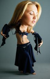 by RickLaMesa 11922 views - final score: 56.5% | Evolution  by minnie 6375 views - final score: 56.1% |
The Nose Knows  by MossyB 13658 views - final score: 55.3% | Big Head Big Hat  by Drivenslush 9110 views - final score: 55% | Son of Zeus  by Vexycon 36761 views - final score: 52.9% |
Ode to the Body  by Drivenslush 7787 views - final score: 52.1% | Ally Oop Girl  by Glockman 6230 views - final score: 51.9% | Pucker Up, Valentine! 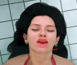 by MossyB 11236 views - final score: 51% |
Oops  by filantrop 4226 views - final score: 50.5% | Big Hair Day  by Drivenslush 8065 views - final score: 49.4% |
Howdie Guest!
You need to be logged in to rate this entry and participate in the contests!
LOGIN HERE or REGISTER FOR FREE
Photography and photoshop contests
We are a community of people with
a passion for photography, graphics and art in general.
Every day new photoshop
and photography contests are posted to compete in. We also have one weekly drawing contest
and one weekly 3D contest!
Participation is 100% free!
Just
register and get
started!
Good luck!
© 2015 Pxleyes.com. All rights reserved.


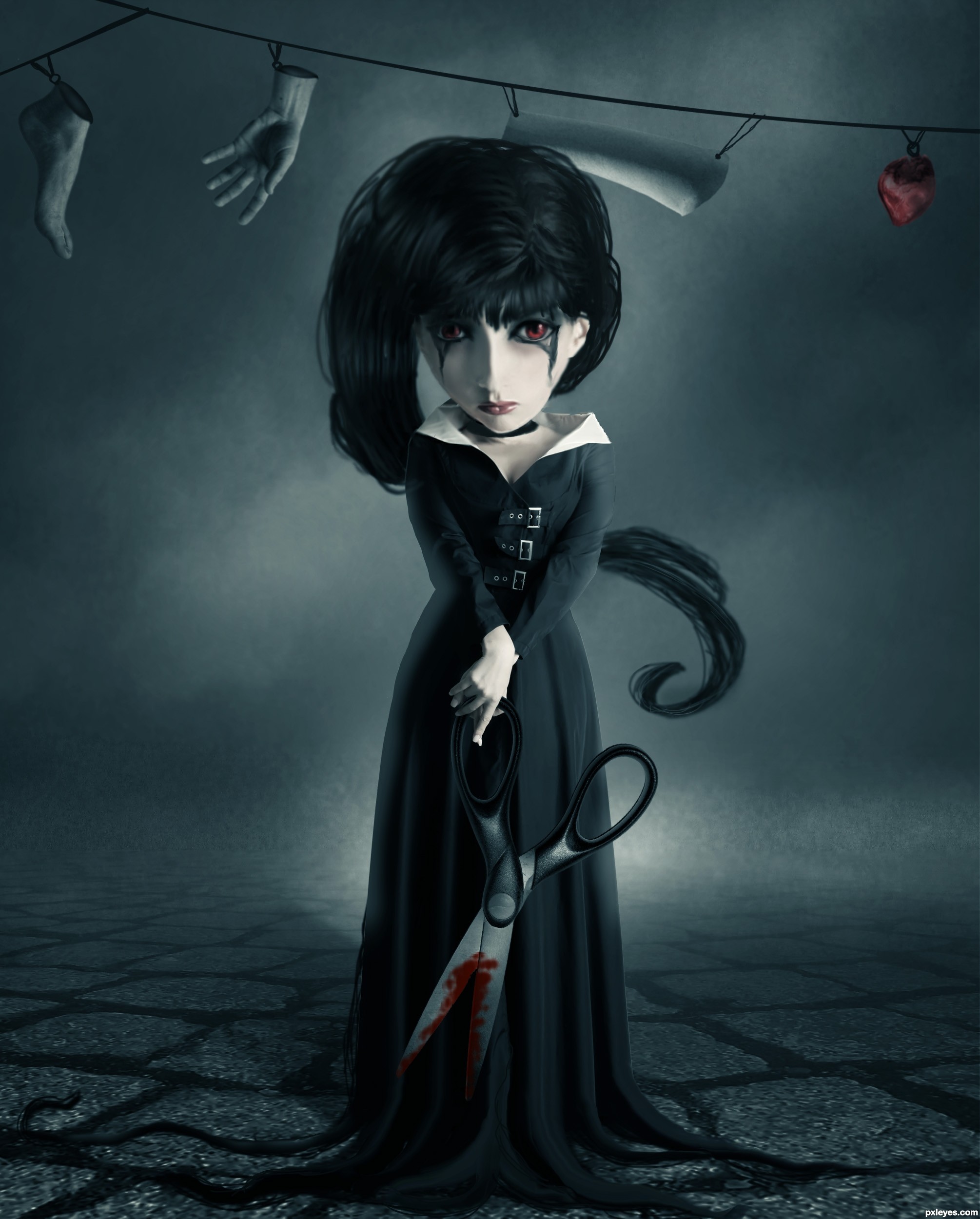
The neck area looks kind of wonky - The really dark shape beneath the head makes it look like the head is floating, and it doesn't look at all like a shadow...Nice job on the background!
Very good
The general mood, the colors and theme is nice, it's some details which could make the entry more finished. That's imo mostly the hair, that looks a bit too roughly drawn compared to the more clean rest of the images. Pay a bit longer attention to it, perhaps you can add a blending layer (with mode multiply) to make the dark parts a bit darker so the hair looks somewhat more smooth. Or just use a tinier brush to get thát detail which make the image more like a whole. Same story would be for the strings. Perhaps here and there the edges from the suit can be a bit softer too. But for the rest I'd think that Tim Burton would like this .
.
@Mossy: not sure, but maybe the dark shape you mention is not necessarely a shadow but some kind of necklace?
Author, good luck!
Other than maybe make the right side of the head the same shape of the left (since she's staring strait out) it looks like her head is deformed but other than that, this is still one of the best entries I've seen. Fix that and I think you just might have a winner. GL!
I tried to fix the most critical parts, really thanks for you guys for making me know.
with few little adjustments this could be a fantastic image(mostly the hair)..but having said that, i really like it..the mood is great..goes to my fav's..good luck!
I really like this image! I couldn't really tell what was on the right side of her untill about the 5th look. Also not sure why you added an sbs with just one background image?
like the concept very much..., good luck author
love this, good luck!!!
Gruesome little thing isn't she. Has a very doll-like quality to her which makes it more impressive considering the scissors and the clothsline! Love the concept!
congrats on a well deserved 1st place
Congrats for the first place !
Congrats, this is really creepy
congrats very nice work.
congratulations...
Congrats!!
congratulations...
Congratulations darling, you deserve it!
Howdie stranger!
If you want to rate this picture or participate in this contest, just:
LOGIN HERE or REGISTER FOR FREE