(5 years and 3338 days ago)
7 Sources:
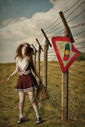
- 1: Road to Home
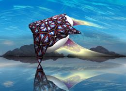
- 2: sky texture
- 3: planet texture
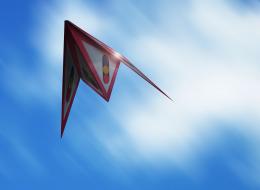
- 4: Blue sky
- 5: planet texture 2
- 6: City lights
- 7: Tech texture

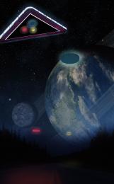

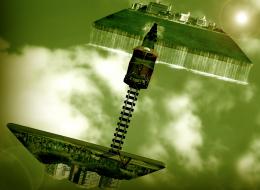
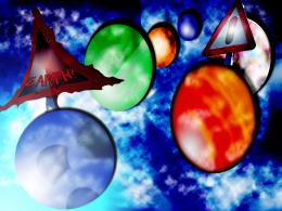



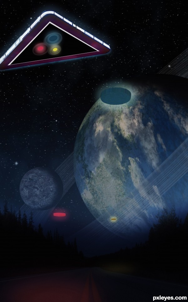
The top of the planet on the RH side is too black and dark, and the very bottom is too dark, and just "wasted" space. It would help your overall composition to just crop the bottom off a bit.
Wow! I think I would have to check my pants if I actually saw something like this while taking a stroll through the forest.
fantastic sky work....gl author
Thanx Pixelkid and erathion , I love creating Space Scape images.
MossyB, I appreciate the comment. I see what you mean, I cropped it and moved it down a little bit. And the dark part of the planet, all planets have night and day, and the dark part to the back of the planet is the night side.
very nice stuff, good luck!
Howdie stranger!
If you want to rate this picture or participate in this contest, just:
LOGIN HERE or REGISTER FOR FREE