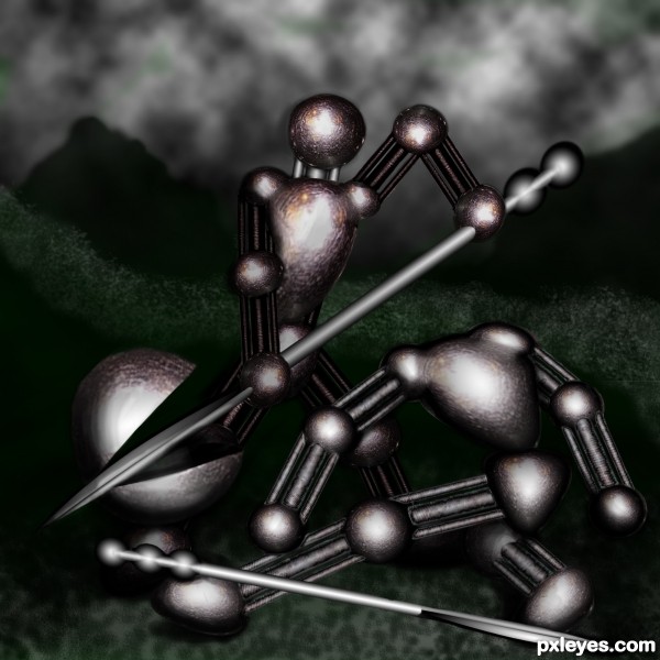
dual till the end (5 years and 3324 days ago)
Golden  by CorneliaMladenova 6629 views - final score: 59.4% | Purple Pillow Pussy  by artgirl1935 10795 views - final score: 56.7% | Flowers  by Ory 6139 views - final score: 55.7% |
Games over stick man  by JamesP 12492 views - final score: 55.4% | Inferiority Renders to Merit  by Drivenslush 6532 views - final score: 54.2% | Whisk Fashion Accessories 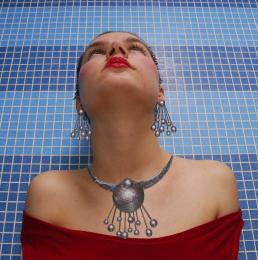 by MossyB 9317 views - final score: 51.4% |
The Weather Company  by Drivenslush 5625 views - final score: 51.3% | wisk invasion 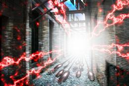 by redlinetabtab 4100 views - final score: 51.3% | gold atlas  by kushpatel 11170 views - final score: 51.1% |
Alien Eyeball Room 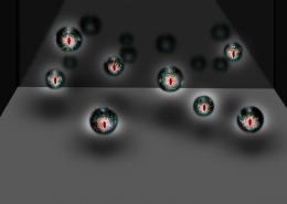 by PSA2009 6794 views - final score: 50.6% | Wiskas 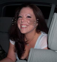 by sgc 4728 views - final score: 50.3% | steel flowers 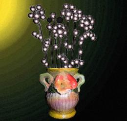 by housy 8187 views - final score: 50% |
Hit the Ball 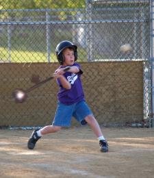 by suni271980 7480 views - final score: 49.6% |
Howdie Guest!
You need to be logged in to rate this entry and participate in the contests!
LOGIN HERE or REGISTER FOR FREE
It's too dark. The viewer cannot easily make out what your focal point is, or how it relates to the title. Bring up the lighting so it's a full image, not just some light spots.
k, i tried to lighting it up some and put a litle green in the back to contrast the red...
Better, although still a bit too dark to tell much of a "story." The green does a good job of helping the color contrast, which improves the overall composition. Good luck!
Thanks - one of these days I may figure out photoshop
Howdie stranger!
If you want to rate this picture or participate in this contest, just:
LOGIN HERE or REGISTER FOR FREE